Your Landing Page Sucks (Yes, Still)
The Landing Page. Yes, in 2018, this is still an important part of your arsenal of marketing skills as a startup. That’s why at StartupYard, I still do a full-on workshop on just this topic, and why with every startup we accelerate, we drill these basic themes over and over again.
Why? Because the ability to write and execute an effective landing page depends on a very clear grasp of good marketing in general. A landing page is a “single serving communication,” or a piece of marketing that has to speak for itself, and be judged on its own. So it is also a great testbed for ideas, and seeing what works, or doesn’t work.
Since we face many of the same challenges with startups year after year, I thought it was high time to publish a post about the basic principles behind an effective landing page. These strategies can be used in many forms of communication (like email), because they focus on understanding the *why* of messaging decisions, rather than the *what* of any particular message.
What is a Landing Page?
For the purposes of this discussion, a landing page is a part of your website (or online product) where visitors “land” first. Depending on what kind of company you are, you might have only one landing page: your Homepage. Or you might have many. A blog post can serve as a landing page if it is meant to draw people in via search or social media.
Here are some examples of successful modern landing pages of different kinds. Take a moment and appreciate what about them is consistent and familiar.
In this discussion, we’re going to follow the KISS principle, and only talk about one kind of landing page, which is the single-purpose landing page, with one target audience, one message, and one call to action.
The Trust Pizza
Over the years, I’ve worked as a copywriter on uncountable landing pages, and other single-use marketing materials for scores of startups. I’ve devised a very simple formula for determining whether I am being effective with a particular page.
Content is King, as we say. A great message is most important. But an effective message follows from the right approach. Having a formal structure that is designed to be foolproof is important in helping you shape a message.
My formal approach is simple. I call it the “trust pizza.” Here’s what it looks like:
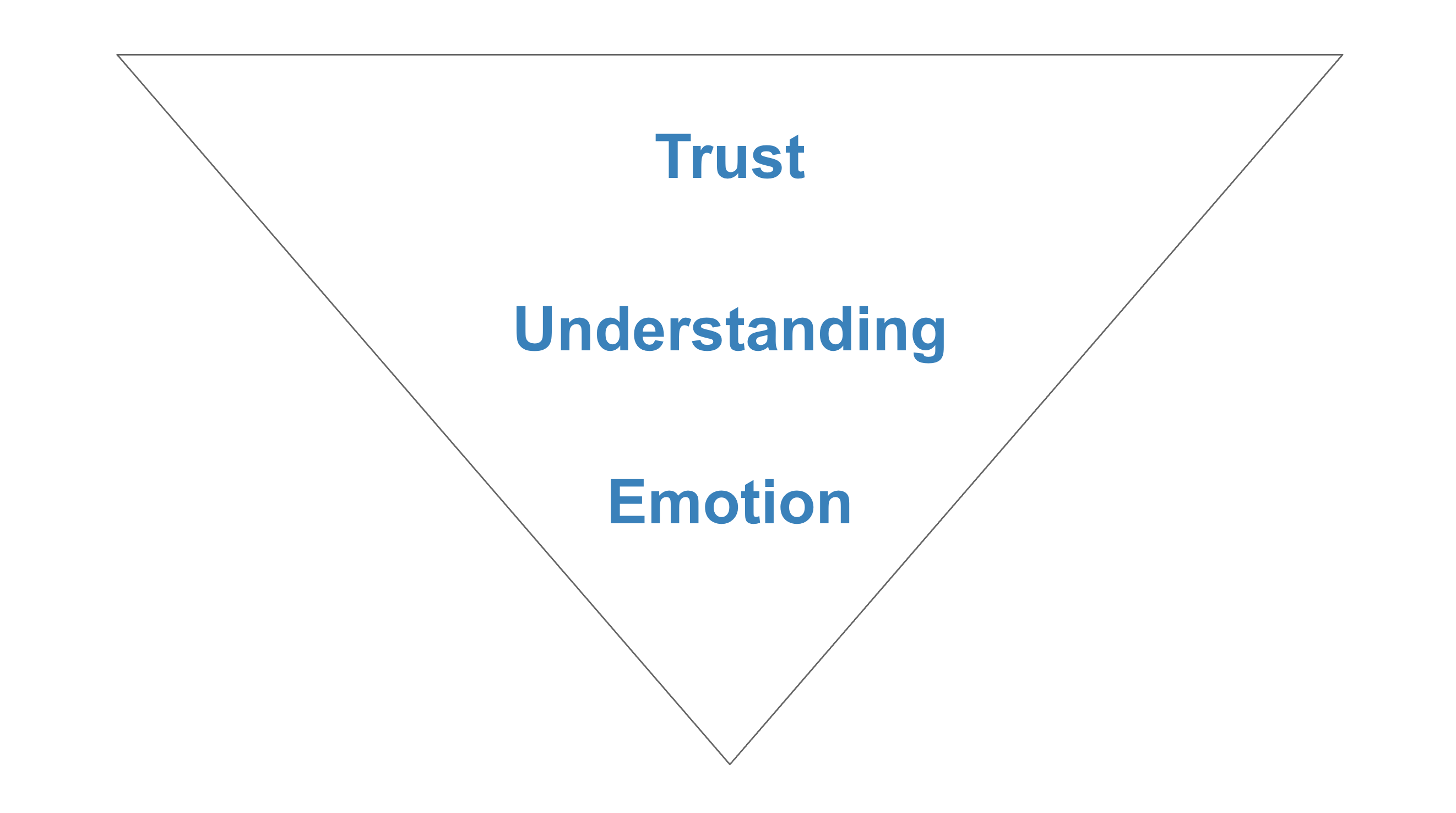
What is important about the Trust Pizza is its shape and the order of ingredients. Follow this simple strategy, and you’re much more able to judge whether your landing page is likely to work or not.
-
Trust = Crust
The most boring but essential element of the pizza is the crust. Not only do we grab a pizza by the crust, we also use the crust to judge the pizza overall.
Just think about evaluating a pizza. If the crust is burnt, what does that tell you about the overall quality of the thing? On the other hand, if the crust is soft and inviting, then you know the pizza will probably be good. Looking at the middle of the pizza tells us very little about it: it might be good, but we can’t know.
The “outer layer” of a landing page is just like that. Trust is composed of every background element of your page. Do you have a header and footer? Do you have appropriate links and contact details? Is the font, color and any background image on-brand?
You should spend as much time on these details as you do on the central message of a landing page. These things tell us whether you can be trusted at all, much less believed in this particular case. Get them wrong, and forget about anyone taking a “bite” out of your landing page.
The trust crust also reminds us not to get too clever. At the end of the day, no matter how revolutionary the idea, a pizza still looks like a pizza. So it is with a landing page. The content should be interesting, but not *less interesting* than the format.
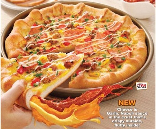
Not only confusing, but actually disgusting.
If you want to give the impression that you’re incredibly hip and modern, do so with the understanding that this may be the only message that gets across. I may admire a pizza shaped like the Eiffel tower, but I don’t want to eat it.
2. Understanding = Toppings
The “understanding” aspect of your landing page is the heart of the message. It is the information you want to convey. It’s often a number or a date. It’s a key point. If a visitor remembers anything about you, it should be this.
Of course when you order a pizza, the toppings are the focus. They differentiate your pizza from all other pizzas. Cheese and pepperoni is totally different from a cream sauce with BBQ chicken.
But remember: an effective pizza has only the right combination of toppings. Go too crazy, and you turn something good into something truly nasty. Burgers are good. Fries are good. Nuggets are good. But all 3 on a pizza are not good, they’re gross.
Adhere to the KISS principle (Keep it Simple Stupid), when choosing your toppings. If you aren’t sure how to blend two ideas together, then don’t try. Choose the most important one, and go with that.
Better a few good toppings than a mess of bad ones, right?
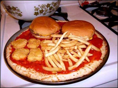
All of these things individually are amazing. All of them together are horrifying.
3. Emotion = The First Bite
Finally the good stuff. The pointy edge of your landing page pizza is the spot at which a customer will “bite.” So you need to give them a good reason to do so. You’ve presented an appealing crust, a nice set of toppings, and now you want a nice, crisp wedge shape to finish the job.
This is the Call to Action. The button, or other cue which should prompt a person to do something (take a bite of the pizza), and be led somewhere else on your website, or in your customer funnel.
The call to action is the simplest but often most important part of a page. It prompts the user with their next move, and at the same time must show them exactly what happens when they click the button, follow the link, or enter their information. The “ first bite” has to be rewarding enough: it has to be mouth watering.
The Pizza Shaped Landing Page
The above is a tool for planning and assembling the elements of your marketing message for a landing page. But remember that just as you must form a pizza from raw ingredients into a certain shape, so must you shape a landing page to be enticing and “edible.”
One of the keys here is “visual momentum,” or what I call the pinball effect. That is, the attention and visual interest of the page should eventually lead down to the place where you want eyeballs to be. It can’t *start* there, but it shouldn’t end somewhere else. No big exciting things to see off to the side. No distractions: just one bigger message leader to a smaller one, leading to a simple action.
In principle, you should try to keep the three key sections of your landing page organized in order of interest:
- The Headline
- The Body (or Subhead)
- The Call to Action
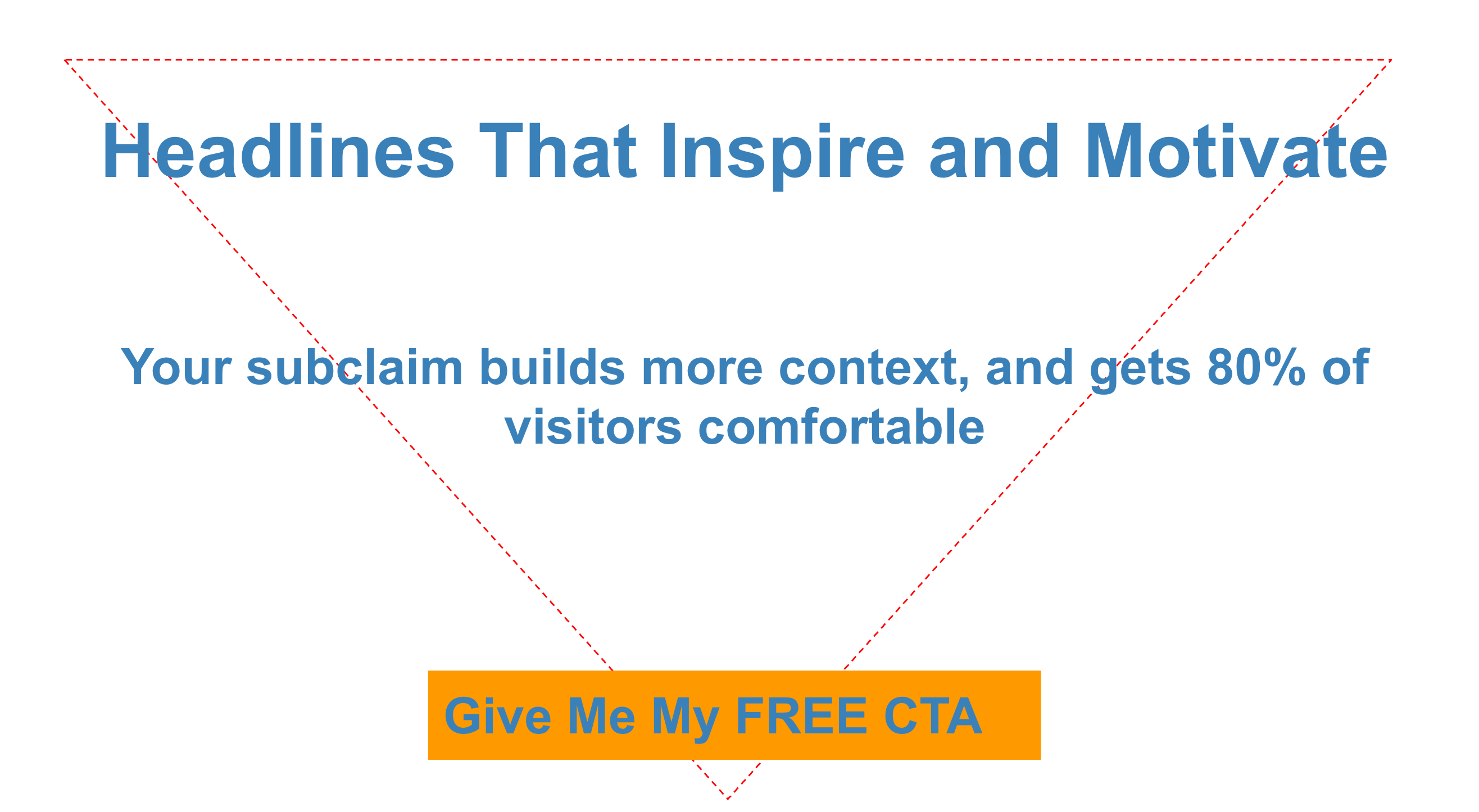
The Headline
The headline, while simple, should grab the most interest from the beginning. It is something bold and maybe unexpected. It is not, I repeat, *NOT* a list of buzzy words like: “Analyze. Evaluate. Innovate.”
That’s just lame folks. Your headline needs to be a statement about why you’re different. It should be something ripped straight from the “unlike” section of your positioning statement. It can even be negative: “Don’t Be Lame,” or “Had Enough BS for One Day?”
That’s an eye-catching statement. Something weak and defensive is not eye-catching. “We Care about You,” is not compelling. “Our Customers Come First,” is an eye-roll at best. Say something definitive about what makes you different, and more importantly, why your customer should even care.
Remember: the Headline is about letting the visitor know what they’re in for. It’s a signal of what’s to come. So it needs to be a strong one.
The Body (Or SubHead)
Here you have the most freedom. It’s toppings time! You should include numbers, or statistics, or outcomes that your product or service will provide. What’s the difference between a pizza you love and one you hate on sight? The toppings.
“Trusted by 3 of 4 Startups,” for example, or “Proven to lower your costs by 30%.” These are informative, direct statements about what the product is promising to do for the customer. They’re beautiful sausage and pepperoni, or olives if that’s your thing.
If the landing page is for an event or a sale, then it might be time to include the date or time.
Remember the It’s Not About You principle. This is not the time to explain that you are a bio-organic-cruelty-free-lactose-intolerant team of albino hemophiliacs who identify as lawn ornaments. The customer wants to hear what’s in it for them. You’re trying to tell them you’re using artisanal cheeses made by blind pagan craftsmen in the alps, but they want to know if the pizza is vegetarian or meat-lovers. They want the facts, not the fluff.
Now is also *not* the time to sell or urge action. Don’t jump the gun here. You’re being informative. You’re showing the meat of the offer, not closing the sale.
The Call to Action (Take a Bite)
Now you’re closing. The call to action is simple but very tricky. You want to accomplish a bunch of objectives at once, to some degree or another. You want the visitor to know a number of things:
- What am I supposed to do
- When am I supposed to do it
- What will happen
- When will it happen
And remember, this is a call to action that may be as long as two or three words. It has to accomplish a lot in that space of time. It needs to rely on context and build upon the preceding elements to do that.
But always consider the call to action in this context: Is it clear to the reader exactly what will happen when they press that button? And is what they think is going to happen the same as what will actually happen? As a landing page is meant to create a relationship, you need to start it off by delivering on what you’ve promised.
Don’t offer something in your call to action that you can’t deliver. Don’t lie. Don’t even get close to maybe being a little bit dishonest. Just don’t do it.
Here are some common “Call to Action Lies” to avoid, along with the reasons they suck:
- It’s Free! [But give us your credit card lol it’s not free]
- Start Your Trial [Actually give us your contact so we can sell you]
- Get it Now [But you have to wait a while]
- Get the Beta [When it’s ready if ever]
- Learn More [Just kidding lol buy now]
Instead, a call to action should do exactly what the user expects. If you want their email, say: “Enter Your Email,” if you want them to buy, say: “Buy Now, Save X.” If you want them to demo the product, then make the demo accessible when you say it will be.
Remember: If you’re thinking it’s a cheat, then your visitor is too. Don’t treat your customers as dumber than you are. Assume they’re smarter.
Stick to the Trust Pizza
Remember, whatever decisions you make about *what* to communicate, never forget the importance of *how* you communicate it. In my experience, more than half of the message is not the words you use, but rather their format.
Does it look right? Does it make visual sense? Is it weird or somehow off? These details make or break a landing page much more easily than a less than perfect turn of phrase. Stick to the pizza. Don’t reinvent it.