The Good and the Bad of 4 Wireframing Tools
We’ve been focusing lately on how you can make a pitch more real. But a focus on “story,” and making your products more accessible to your potential partners, your investors, and your future customers means more than defining what your product does. A wire-frame can help you to understand how your own software products will work, and how people will relate to them, use them, and react to them.
Do More Wireframing
It’s genuinely shocking to me how many products don’t seem to have been tested at all during the design process. I bought my wife an Amazon Kindle Paperwhite for Christmas (actually my mother bought it for my wife, I just picked it up at the store), and was dumbfounded by the stupidity of the UI design- especially considering the enormity of the technological potential in every other facet of the device. And it’s not like this is a new problem for Amazon. It’s like they read the first rule of usability, but stopped before reading any of the other associated rules.
If you’re Amazon, maybe you can afford to advertise products that don’t really work. But for a startup, UX has to be much higher on the list of priorities. Lean methodology is more than a way of working on code, after all. It’s about marketing, branding, and product design as well. Everything you do at the beginning of your process will have an affect on what comes next. You have to emphasize the benefits of your products from the earliest possible opportunity- even before you complete them. Making your products a better reality for people -something they will wait for and invest in- means showing them what that reality will look like.
Constructing Reality
IBM made a brilliant commercial in 2000 for a product that looks suspiciously like Google Glass. It is a product IBM never actually made. While it may appear to be nothing but an exercise in brand promotion (which it was), it presented a flawlessly rendered future reality to a customer base of mostly business users, showing them what the world would look like, for them, if they stayed with IBM the next time they made purchasing decisions. This is what you have to do: make it clear that the choice of the future, no matter the area your product is in, is your company. Wireframes and working prototypes build confidence in your ability to realize your ideas, and build expectation for you to deliver on your highest potential.
Below we’ll split 4 popular wireframing/mockup tools into two camps: “picture perfect” design tools for creating a prototype that looks and feels like a real working product in an existing operating system, and “rapid prototyping” tools that you can use to lay out your product designs quickly, and with a minimum of fuss over design. So whether you want a prototype that looks like the real thing, or something that you can slam together and build on quickly and with a minimum of fuss, you’ll find something here.
Picture Perfect Mockup Tools
Keynotopia
“Use Tools You Know”Key Features
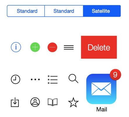
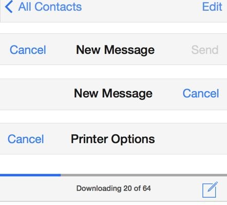
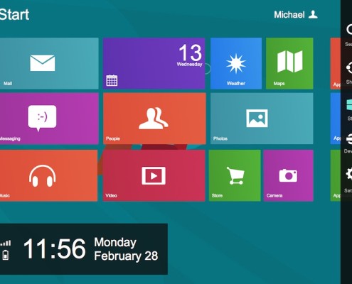
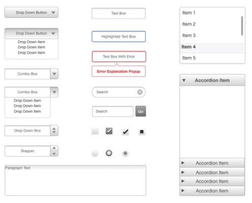
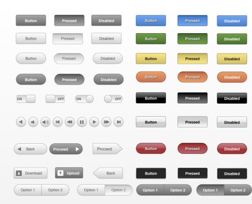
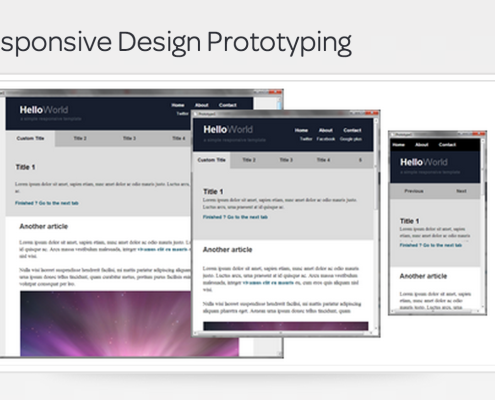
Keynotopia leverages Keynote, Powerpoint, or OpenOffice presentation tools to allow the user to construct a working prototype using native presentation tools found in software they already have installed (or available free from OpenOffice). This basically boils down to a long list of well-designed and thoroughly catalogued UI elements, available as template sets. These elements are close facsimiles of the real developer elements used in a given OS, but can be used easily in presentation software. It’s then up to the prototyper to leverage existing tools in Keynote to make the App UI work the way they want it to. This can be scaled to whole webpages, or restricted to a mobile app space.
Key Drawbacks
While Keynotopia will be great for getting a near-final visualization of a product or process in an existing UI, it doesn’t have any options for element customization. This means that any app or page you design will be strictly by the book: no custom banners, or other nifty design elements to make your page stand out. The web-page design in particular is limited to a close approximation of Twitter Bootstrap, so any web pages you design are apt to look like Twitter clones, more than unique apps. And because it is all based on presentation technology, don’t expect to model more complicated processes than simple navigation in an app or web page. Plus, you’ll be stuck when it comes to how your app might look on a horizontal screen if you only mockup the vertical version. You’ll have to design every version from scratch to make it work.
Optimal For
Creating a slick proof of concept, based on popular UI elements, with limited interactivity.
Pricing: A Little Much?
$45 Per Template (Eg: IOS7, Surface, Web), with free upgrades.
$149 for 18 Templates, and a 10% discount for volume orders (10 people or more)
JustinMind
“Build the Right Apps From the Start”Key Features
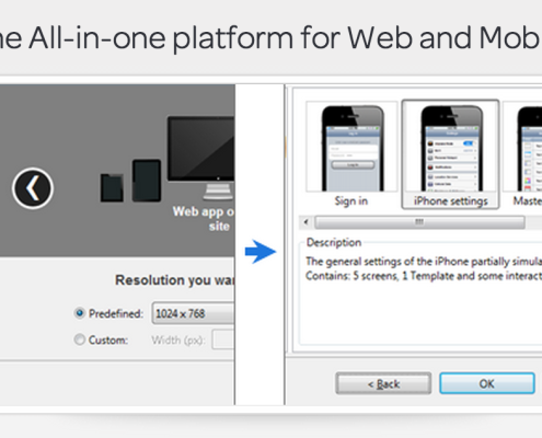
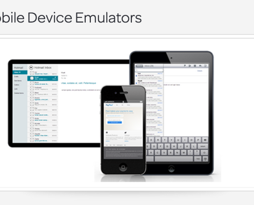
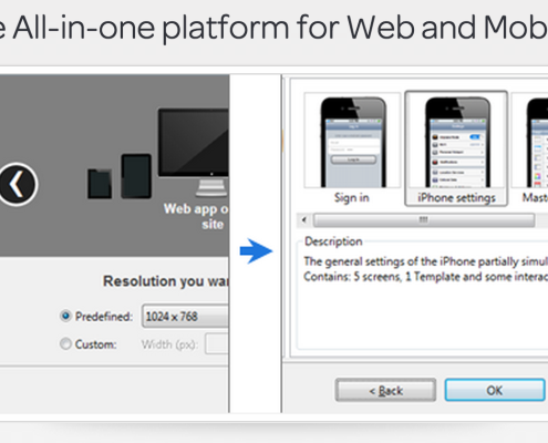
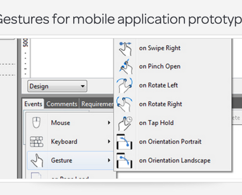
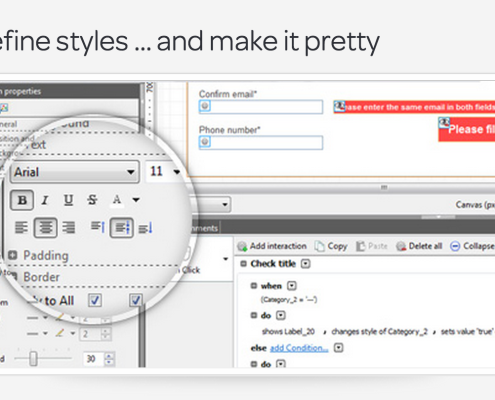
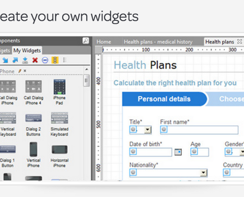
An apparently powerful “simulator,” for mobile and web apps that allows you to mimic the behavior of a mobile device on your desktop. This program comes with built in operating system UI that allows the user to contextualize an app or webpage in a mobile device operating system, and allows a huge range of simulated functionalities, without any coding. The big advantage here is that the program comes loaded with a lot of functionalities you will probably want to use when constructing an app, so you don’t need to code every single one- they have done this for you.
Key Drawbacks
While their promotional videos make it look like you’re going to get a picture-perfect app, expect not to be able to carry this one off without the help of a designer. The program includes the ability to import elements (for instance, from Keynotopia), and it comes with sets of UI elements from different operating systems. But don’t expect to have an easy time creating customized elements for your own app. Because it’s more focused on mimicking the behavior of real mobile devices, it doesn’t have a strong set of tools for designing UI elements. While you can design elements here, you may find it rough going if you’re not a design person.
Optimal For
Creating a deeper sense of how an app or page will function, especially on mobile devices. Also optimal for a UX designer in cooperation with a graphic designer.
Pricing: Not Cheap
$30 Per Month, or $228 Per year for Individual User. Slight discounts for multi-licenses.
Rapid Prototyping and Flow Design Tools
Key Features
A hosted Web app makes Balsamiq more of a community driven space than many wireframing tools. You can find inspiration or advice on their active community pages. Another huge advantage of Balsamiq is their iteration and versioning tools, which allows users to save a wireframe in versions, and track changes to the UI easily, allowing you to quickly, and non-destructively, update and change your designs without worrying that you’ll get off-page with your co-workers who may be coding the designs. Unlike the picture perfect options above, collaboration on designs is a key part of what Balsamiq is for: it sacrifices visual appeal in favor of streamlined, sharable sketch versions, that can be easily worked on by multiple members of a team.
This can be a big plus for a team that may focus too much on details instead of the big picture, and it allows everyone to get their say on app functionality long before a single element is ever designed or coded. Plus, Balsamiq has lots of versions, including web-based, Jira-compatible, desktop, and Google Drive based.
Key Drawbacks
Balsamiq doesn’t include photo-realistic UI elements, but instead requires a little imagination. This can be fine for a team of developers, but it may not be right when modeling a product idea to an investor or a major partner. Also, Balsamiq is a little weak on elements many web-designers may be looking for, with its heavy focus on desktop applications and mobile apps. While its versioning system is great, it doesn’t really suite web design, with kludgy mastering tools, and a set of elements that can make a page hard to visualize. Importing elements like images and media is not the priority here- more sketch than functional prototype.
Optimal For
Rapid prototyping of a desktop or mobile app with collaborators. Side-by-side continuous design changes with easy version tracking.
Pricing: Not So Bad
Desktop App: $80
Hosted Service: $12/M for 3 projects, $24/M for 10 Projects, $49/M for 20 Projects, $99/M for 50 Projects
Plugins: Google Drive/Jira/Confluence: $5/M or $50/Y
Key Features
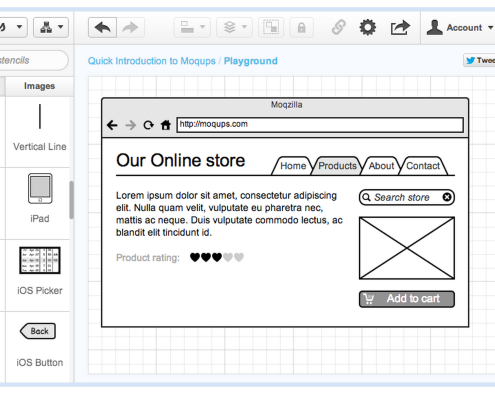
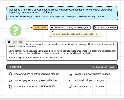
I always loved this program, because it’s exactly what it says it is on the tin. Unlike most such programs, logging into Moqups gets to a start page that actually uses the design tools its selling. You can play around with it easily, and for free.
The coolest feature Moqups has is the mastering system, which allows you to easily proliferate and version a web page or an app based on a master, which you can also change at any time. Interaction is limited to buttons and tables that scroll, so don’t expect an app that does more than allowing simple navigation. But that’s the beauty of Moqups: it doesn’t distract from the conceptual process much at all: it’s a sketchbook, pure and simple. Plus, Balsamiq is a great value considering the quality.
Key Drawbacks
There are, as noted above, a lot of things missing from moqups. While you can ostensibly import media, there’s not much you can then do with it. You’ll never get close to a finished product using Moqups, but it’s a great way to map out of a web-page or an app might work in terms of navigation and overall design basics. There are also no good notation tools, meaning collaboration with developers will have to go on using Moqups and some other software for tracking versioning, or commenting the design.
Optimal For
Rapid sketching of the flow of web-pages, especially for figuring out product page functionalities, designing landing pages, and preparing concepts for a graphic designer or an HTML/PHP developer.
Pricing: Bargain Basement
9€ For the basic plan: 10 active projects and unlimited archived projects, 1GB of Data.
19€-39€ for more active projects and data up to 10GB
[ssba]

