What I learned in 18 Months as an Email Marketer (Part 2)

Advertising to Sell Vs. Advertising to Learn

It’s quite common for a small company in ramen profitability to start treating every conversation with customers as a sales opportunity. That’s the right attitude, anyway. As I’ve mentioned here in the past, every interaction is a a kind of sale. Either you are selling yourself to an investor, the media, or a partner, or you are selling your product to a customer. But just as you should always refine your pitch based on how well it has actually worked, you should do the same with your advertising. In fact, you can use advertising as a very cheap and effective form of research.

Shopping your Brand, and Testing Assumptions

Shopping your brand is sort of like focus-grouping, only you do it in the wild, and you use real customers as the focus group. The idea is to get a good sense of whether your target market is who you think it is, and if so, what that group responds to best.

You may run into some surprises doing this. The people you are most willing to buy your products may not always be the ones you’d expect. A classic industry example is women’s underwear: Victoria’s Secret has long known that male customers will spend more money, faster, than women buying the same products, and will be less interested in discounts and sales. And the reasoning is simple: men feel uncomfortable shopping for intimate items, and also don’t want to be caught looking cheap while doing it.

By the same token, though women may take longer than men to make purchases online, they also buy more electronics than men do, and consume more online media, and spend more time on social networks, taking the majority share in Facebook, Twitter, and Pinterest.

Catering to a demographic doesn’t have to mean talking down to that demographic either. You don’t see Apple making stereotypical “lady Iphones,” but their products are possibly more popular with women than with men. I can guarantee: Apple tests their taglines and slogans on women as much as they do on men. If you were selling a sleekly designed, high end electronics toy to the top of the market, would you care what women thought of your marketing?

Assumption testing can prove that your products are appealing to people you never considered potential customers, and for reasons you haven’t even thought of.

Case in Point:

Cedric Maloux, our CEO, created an app for IOS last year, and as soon as he had a working app, he “shopped” it using a number of targeted ads on Facebook. And since Facebook allows you to segment your market and target your ads to people based on sex, he decided that he wanted to know which taglines would work more with women, and which with men.

Because the nature of the app was targeted at a hobby that is overwhelmingly popular with men, he was surprised to find that women responded to the ads too. Not as much as men did, but there were key taglines that women responded to. There were ways of representing the app that appealed to women even more than they did to men. And by using the “advertise for research” approach, he was able to zero in on marketing that worked across these different segments.

And it isn’t just gender, either. There are loads of assumptions you probably make about your customers, and which you can test very effectively for little cost.

Agile Marketing: How it works

Agile methodologies don’t work every step of the way. There’s no set of iterations you can take in coming up with your products that will take you from no idea what to do, to a completed project. You need to be inspired first- and without that, there is no testing to do; no basis of comparison between a non-process and a good process. The same is true of agile marketing. It relies best on a seed of inspired thinking about your customers and your product, followed by rigorous and ego-free examination of what really works. I’ve done tons of marketing material that I loved, and only a small minority of it ever worked well. That makes marketing and coding not so different at all.

Start with Simple Questions

Like, what’s the first thing my customers see? Does it work? Does it work for the market I’m targeting? Could something else work better? Where am I losing customers?

 If your company already has a logo, then you probably have a slogan and associated taglines too.  There’s plenty of advice available about how to write them, and it isn’t actually that hard. I mentioned recently that a tagline or a slogan is more like a static element for a website. It’s fertile ground for A/B testing, and that’s what you should be doing- all the time, and not just for the homepage, but also landing pages for any campaign you run.

You can start with broad assumptions about your customers. Segment them into “likely,” and “unlikely” customer groups, and run a couple of different versions of ads and associated landing pages for each group. Create ads targeting both groups, and show them to both groups too. If your likely customers respond to the ads that target them, then you know you’re right about your market and your strategy. But if your unlikely customers respond more than you anticipated, you can continue to segment them, dialing in the specific messaging and the specific part of that market cohort that *is* responding to your marketing. You may find you’re sitting on a potential client base you never considered. And if your likely customers respond to your ads for your unlikely customers just as much as the ones targeted at them, then this may tell you that your messaging to these customers is not as effective as you thought it might be. You may have more opportunities to sell to this group with a different approach.

Set Clear Goals

Using a system like OKRs, set objectives that involve clear answers to your simple initial questions. For instance, a question like “Is my purchase page losing sales because of the design?” can be associated with an objective like: “improve purchase page performance by 25%,” with key results being simple items like: “define the most effective call to action,” and “reduce distracting elements that cause users to bounce or navigate away.” Now follow the formula: testing incoming hits on the purchase page while cycling through these changes. You may find that something as simple as a stronger call to action can raise your conversion rate from 0.20% to 0.25%, and in terms of an online store, that’s can be an enormous increase in revenue.

Shocking how often this works.

Shocking how often this works.

You may well be shocked to realize the difference a single element makes in your overall revenue when it iterates itself over thousands of hits on a landing page or a homepage every day. There, a tagline that works just 1 time in 1000 more than another can mean the difference between life and death.

But you want to be doing this testing now- not when thousands of page views are already in play. That’s why small ad-buys on facebook or other platforms can give you the intelligence you need to get ahead of these questions- before you realize you don’t have it right.

[ssba]
The Good and the Bad of 4 Wireframing Tools

We’ve been focusing lately on how you can make a pitch more real. But a focus on “story,” and making your products more accessible to your potential partners, your investors, and your future customers means more than defining what your product does. A wire-frame can help you to understand how your own software products will work, and how people will relate to them, use them, and react to them.

Do More Wireframing

It’s genuinely shocking to me how many products don’t seem to have been tested at all during the design process. I bought my wife an Amazon Kindle Paperwhite for Christmas (actually my mother bought it for my wife, I just picked it up at the store), and was dumbfounded by the stupidity of the UI design- especially considering the enormity of the technological potential in every other facet of the device. And it’s not like this is a new problem for Amazon. It’s like they read the first rule of usability, but stopped before reading any of the other associated rules.

If you’re Amazon, maybe you can afford to advertise products that don’t really work. But for a startup, UX has to be much higher on the list of priorities. Lean methodology is more than a way of working on code, after all. It’s about marketing, branding, and product design as well. Everything you do at the beginning of your process will have an affect on what comes next. You have to emphasize the benefits of your products from the earliest possible opportunity- even before you complete them. Making your products a better reality for people -something they will wait for and invest in- means showing them what that reality will look like. 

Constructing Reality

IBM made a brilliant commercial in 2000 for a product that looks suspiciously like Google Glass. It is a product IBM never actually made. While it may appear to be nothing but an exercise in brand promotion (which it was), it presented a flawlessly rendered future reality to a customer base of mostly business users, showing them what the world would look like, for them, if they stayed with IBM the next time they made purchasing decisions. This is what you have to do: make it clear that the choice of the future, no matter the area your product is in, is your company. Wireframes and working prototypes build confidence in your ability to realize your ideas, and build expectation for you to deliver on your highest potential.

This commercial was made in 2000, by IBM.

This commercial was made in 2000, by IBM.

Below we’ll split 4 popular wireframing/mockup tools into two camps: “picture perfect” design tools for creating a prototype that looks and feels like a real working product in an existing operating system, and “rapid prototyping” tools that you can use to lay out your product designs quickly, and with a minimum of fuss over design. So whether you want a prototype that looks like the real thing, or something that you can slam together and build on quickly and with a minimum of fuss, you’ll find something here.

Picture Perfect Mockup Tools


Keynotopia

“Use Tools You Know”

Key Features

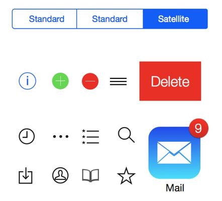
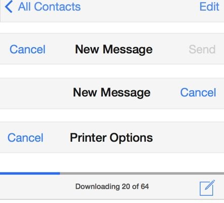
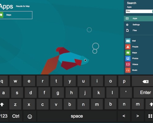
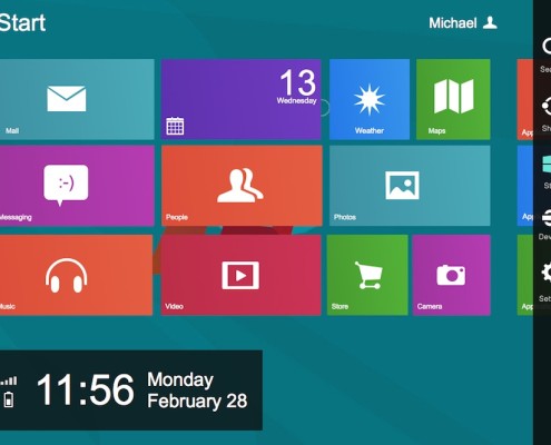
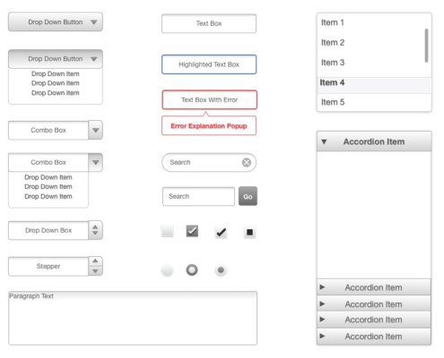
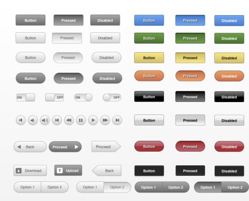
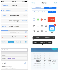
Keynotopia leverages Keynote, Powerpoint, or OpenOffice presentation tools to allow the user to construct a working prototype using native presentation tools found in software they already have installed (or available free from OpenOffice). This basically boils down to a long list of well-designed and thoroughly catalogued UI elements, available as template sets. These elements are close facsimiles of the real developer elements used in a given OS, but can be used easily in presentation software. It’s then up to the prototyper to leverage existing tools in Keynote to make the App UI work the way they want it to. This can be scaled to whole webpages, or restricted to a mobile app space.

Key Drawbacks

While Keynotopia will be great for getting a near-final visualization of a product or process in an existing UI, it doesn’t have any options for element customization. This means that any app or page you design will be strictly by the book: no custom banners, or other nifty design elements to make your page stand out. The web-page design in particular is limited to a close approximation of Twitter Bootstrap, so any web pages you design are apt to look like Twitter clones, more than unique apps. And because it is all based on presentation technology, don’t expect to model more complicated processes than simple navigation in an app or web page. Plus, you’ll be stuck when it comes to how your app might look on a horizontal screen if you only mockup the vertical version. You’ll have to design every version from scratch to make it work.

Optimal For

Creating a slick proof of concept, based on popular UI elements, with limited interactivity.

Pricing: A Little Much?

$45 Per Template (Eg: IOS7, Surface, Web), with free upgrades. 

$149 for 18 Templates, and a 10% discount for volume orders (10 people or more)

JustinMind

“Build the Right Apps From the Start”

Key Features 

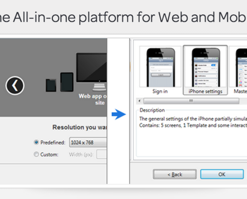
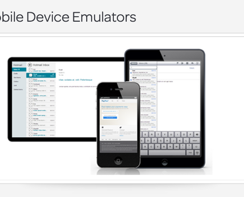
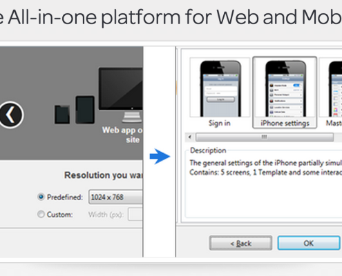
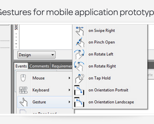
An apparently powerful “simulator,” for mobile and web apps that allows you to mimic the behavior of a mobile device on your desktop. This program comes with built in operating system UI that allows the user to contextualize an app or webpage in a mobile device operating system, and allows a huge range of simulated functionalities, without any coding. The big advantage here is that the program comes loaded with a lot of functionalities you will probably want to use when constructing an app, so you don’t need to code every single one- they have done this for you.

Key Drawbacks

While their promotional videos make it look like you’re going to get a picture-perfect app, expect not to be able to carry this one off without the help of a designer. The program includes the ability to import elements (for instance, from Keynotopia), and it comes with sets of UI elements from different operating systems. But don’t expect to have an easy time creating customized elements for your own app. Because it’s more focused on mimicking the behavior of real mobile devices, it doesn’t have a strong set of tools for designing UI elements. While you can design elements here, you may find it rough going if you’re not a design person.

Optimal For

Creating a deeper sense of how an app or page will function, especially on mobile devices. Also optimal for a UX designer in cooperation with a graphic designer.

Pricing: Not Cheap

$30 Per Month, or $228 Per year for Individual User. Slight discounts for multi-licenses. 


Rapid Prototyping and Flow Design Tools

Balsamiq

“Life’s Too Short for Bad Software”

Key Features

A hosted Web app makes Balsamiq more of a community driven space than many wireframing tools. You can find inspiration or advice on their active community pages. Another huge advantage of Balsamiq is their iteration and versioning tools, which allows users to save a wireframe in versions, and track changes to the UI easily, allowing you to quickly, and non-destructively, update and change your designs without worrying that you’ll get off-page with your co-workers who may be coding the designs. Unlike the picture perfect options above, collaboration on designs is a key part of what Balsamiq is for: it sacrifices visual appeal in favor of streamlined, sharable sketch versions, that can be easily worked on by multiple members of a team.

This can be a big plus for a team that may focus too much on details instead of the big picture, and it allows everyone to get their say on app functionality long before a single element is ever designed or coded. Plus, Balsamiq has lots of versions, including web-based, Jira-compatible, desktop, and Google Drive based.

Key Drawbacks

Balsamiq doesn’t include photo-realistic UI elements, but instead requires a little imagination. This can be fine for a team of developers, but it may not be right when modeling a product idea to an investor or a major partner. Also, Balsamiq is a little weak on elements many web-designers may be looking for, with its heavy focus on desktop applications and mobile apps. While its versioning system is great, it doesn’t really suite web design, with kludgy mastering tools, and a set of elements that can make a page hard to visualize. Importing elements like images and media is not the priority here- more sketch than functional prototype.

Optimal For

Rapid prototyping of a desktop or mobile app with collaborators. Side-by-side continuous design changes with easy version tracking.

Pricing: Not So Bad

Desktop App: $80

Hosted Service: $12/M for 3 projects, $24/M for 10 Projects, $49/M for 20 Projects, $99/M for 50 Projects

Plugins: Google Drive/Jira/Confluence: $5/M or $50/Y 

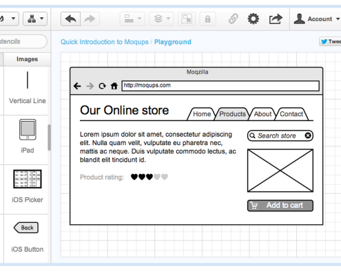
Moqups

“Online Mockups Made Simple”

Key Features

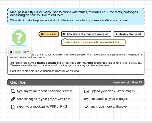
I always loved this program, because it’s exactly what it says it is on the tin. Unlike most such programs, logging into Moqups gets to a start page that actually uses the design tools its selling. You can play around with it easily, and for free.

The coolest feature Moqups has is the mastering system, which allows you to easily proliferate and version a web page or an app based on a master, which you can also change at any time. Interaction is limited to buttons and tables that scroll, so don’t expect an app that does more than allowing simple navigation. But that’s the beauty of Moqups: it doesn’t distract from the conceptual process much at all: it’s a sketchbook, pure and simple. Plus, Balsamiq is a great value considering the quality.

Key Drawbacks

There are, as noted above, a lot of things missing from moqups. While you can ostensibly import media, there’s not much you can then do with it. You’ll never get close to a finished product using Moqups, but it’s a great way to map out of a web-page or an app might work in terms of navigation and overall design basics. There are also no good notation tools, meaning collaboration with developers will have to go on using Moqups and some other software for tracking versioning, or commenting the design.

Optimal For

Rapid sketching of the flow of web-pages, especially for figuring out product page functionalities, designing landing pages, and preparing concepts for a graphic designer or an HTML/PHP developer.

Pricing: Bargain Basement

9€ For the basic plan: 10 active projects and unlimited archived projects, 1GB of Data. 

19€-39€ for more active projects and data up to 10GB

[ssba]

100 to Follow on Twitter in 2014

Who should you follow on Twitter if you want to stay informed about the Internet industry?

Thanks to Vala Afshar here’s 100 of them. It’s a useful list of Business, Leadership and Tech Twitter accounts to add to your existing list for 2014. Thanks to Dane from Bizopy.com for extracting it.

[ssba]
What I learned in 18 Months as an Email Marketer (Part 1)

When I took my first marketing job, I assumed that writing was writing, no matter what you were writing about. So I sat down, strapped in, and learned as much as I could about what it takes to write email copy, landing pages, and sales campaigns. Easy, I thought. Turns out, it’s nothing like normal writing at all. Here’s what I learned.

The Call To Action

“Don’t talk about what you want. Talk about what your customer is going to do.”

Last week we talked here about selling without selling. I’m going to reiterated the 7 principles that are mentioned in that post. These are the 7 elements that should be represented in some way, in every communication with a customer.

Trust: In you and the product. Let the customer do what they would normally do.
Understanding: Be as simple and clear as possible. The customer is not smarter than you.
Emotions: Use humor, use evocative words, show love and caring. Show passion.
What to do: Buy, sign up, click, share, read on
When to do it: Now? Later? Soon?
What I get out of it: Speak about effects of the product, not the features.
When it will happen: Examples, case studies, quotes, and testimonials

Last week we talked about the first 3. Now we’re going to talk about the middle two: what to do, and when to do it.

All of your marketing copy, the copy that is designed to lead a customer from contact with your website or marketing materials all the way to a purchase, has to inspire an action on the part of your customer- to draw the customer inexorably toward a purchase, a sign up, a click, a share, or any action that you want a customer to take.

What it Does

Your calls to action should always be just enough to inspire the viewer to take the next step he/she is comfortable with, and no more, engaging each user to the maximum of their comfort, without scaring them away by pushing them to a sale or action they aren’t ready for. This feeds back to trust: you should never be in the position of asking a customer to do anything he or she doesn’t understand.

If you think of your website or marketing approach as a pinball machine, your customer is the ball. Your marketing emails, landing pages, and homepage are all those little widgets and bumpers that keep the ball moving, and your copy is gravity. When the ball finally ends up falling into the hole, that’s a sale. Here’s the trick: pinball isn’t fun if the slope is too steep, and gravity is too strong. A satisfying sales experience, or any intended customer outcome, is one that feels natural, and rich for the customer. As the customer “bounces,” from one element of your online presence to the other, they should constantly be only in danger of heading towards a sale, never getting there unless they’re ready.

If you think of the customer as the ball, then you shouldn’t worry too much if they don’t go directly to a sale every time. The longer they bounce around and absorb what you do, and who you are, the more likely they are to eventually decide to buy. And the longer they take making the decision, the clearer it will be when they do buy that the product is right for them.

There’s rarely a reason to push: a customer will only ever buy when they are ready to buy, and not before. If you have a lot of hits on your purchase page, but few conversions, then you have probably already realized this: when confronted with a decision to buy, nobody is going to do it earlier than they expected, without a very good reason (that’s where discounts and promotions come in, but that’s another story).

What It Looks Like

Last month, I edited the StartupYard Homepage and a few other landing pages for copy. Our CEO Cedric Maloux had done the layout and the basic copy. Here’s what we started with:

What Are You Working On…?

Data

We’re looking for the craziest, most ambitious projects out there, having to do with the manipulation of large clusters of Data.

Search

Have you invented a new search algorithm to complete, or compete with, the big boys? We want to hear about it.

Analytics

Do you have a new, unique way of making sense out of Data? We have x TB of data for you to play with.

This copy is good, but ask yourself: what are you being asked to do? The first line has an open question. That’s a good challenge to go further. Now we get an explanation, under the Data header, of what we’re looking for: “the craziest, most ambitious projects.” Well that’s nice, but what does it mean? Why are you being told all this?

And in the next header under Search, we explain what we want. Nobody wants to know what we want, unless it involves giving them money. And since we actually do want to give you money, why not come out and make that part clear? The site visitor is not sure who this information is for: does it apply to them? Will they find something they are looking for? They are not being given a direction to go in, only information to absorb. That’s only half of what they need. Here’s the copy with calls to action.

Chpj_R8EYthBhbW4oMH6TYHhFpLnacNFCPV_x8c3somHt3mtmNmAJN3wPoj5zIqs21kZV6_Z0DOAaK2vrnvb742ih0ZDRHRopEdUFTPjTW9EHsh_1ukslEl-dg

Now we have some strong direction. The visitor is being shown what we want, and being pushed to engage to their level of comfort. We have a call to connect in the second column, a challenge in the first, and an invitation in the third column. That’s three ways we’re inviting the user to go further right now. We don’t care how they do that: they can email us, they can read the rest of the homepage, or they can go right to the application. We make it clear here that they’re free to choose. They can seek their own level of comfort with the process.

While it seems superficial, these calls to action have powerful subconscious effects. In Blink, bestselling economics and sociology writer Malcolm Gladwell discusses widely known psycho-social experiments in which individuals are “primed,” with certain words before being placed in a social situation. For example, a person who is told to read a list of words including “patience,” “serenity,” and “calm,” is overwhelmingly more likely to wait patiently for her turn than a person who is told to read words like “aggressive,” “confront” and “fight.”

The words that an individual hears or reads has an enormous impact on how that person behaves in the short period afterwards. Words that prime for activity and exhort action will engender better results virtually all of the time.

Open for Business

Have you ever stood outside a shop or a restaurant, and not been completely sure that they were open, so you didn’t go in? Ever passed a restaurant because it looked closed, only to see someone come out and only then realize it’s open? We all have.

Now, think about those lit-up signs on shop windows; “Come in, We’re Open.” You might think you’re not affected by this kind of thing, but you are. Your confidence, inspired by this tiny little call to action, will empower you to stride directly to the front door and open it. No questions asked.

A homepage is no different. These kinds of calls to action are just a little tiny nudge saying: “We are here for you. This is about you. It’s not a blog, it’s not PR, and it’s not about us, it’s about you.”

A Good Call to Action is not Manipulative.

Sometimes marketers go a little nuts when they figure out that a call to action can be such a powerful thing. What would you do, for example, if I could promise you that I could increase your open rate on emails by 100% in one day? Would you want that?*

*This is a classic call to action, by the way: of course you want to increase your open rate by 100%. You are supposed to say yes.

What they can forget is that no matter how powerful a call to action, you can never sell someone who doesn’t want to be sold. Calls to action are nudges, not shoves.**

**And this is a classic trust-building rejoinder: I am telling you I understand your problem and I understand that the solution is not as easy as some say. I’m showing you that what I’m offering is better than the competition, and that I care about what’s best for you.

If I nudge you, you’ll scoot forward in the direction you want to go. If I shove you, you’ll go in the direction I wanted for a moment, and then start resisting me.

This is no different from the store analogy from earlier.

What kind of salesman do you trust? The one who waits for you to look around, then approaches you quietly and asks if you want help? Or the one who approaches you as you walk through the door and asks you what you’re looking for? The first salesman wants to help you. The second salesman wants to control you.

The first one gives you a choice: tell him what you are looking for, or say no, you don’t need help. Either way, you do what you want. The second makes a demand: tell me what you’re looking for, or break all trust, and lie, saying you are “just looking.” Either way, you are forced to choose between two options you may not like.

You may buy from the second salesman if you know exactly what you want, but you wouldn’t buy from him if you weren’t sure. You haven’t been given the space to establish comfort with his offerings, before he is pushing on you to tell him what you want to buy. And if he is very good, and manages to get you to make a purchase before you’re ready, you would never, ever return to that store. Your embarrassment would be too great. You’d associate him, and that product you bought, with an experience you’d rather forget. This is not a win for anyone.

Online marketing is no different. People know when they are being invited, and when they are being pursued. And they don’t like being pursued in that context.

Do you get those emails from click-bait websites, with some video and a headline that says: “Drop Everything Right Now and Watch This or You Will Be Sorry,” or something to that effect? We’ve all been there. Or maybe you see those chain letters on Facebook, that manipulate you into sharing some overly sweet piece of human misery, that turns out wasn’t true in the first place?

Yes, they work. Once. And while you can get a lot of traffic from a sensational headline, and a big email open rate from a grabby subject line, that’s all you’ll get: traffic. Because people know when they are being manipulated, and they don’t like it.

This kind of marketing is for ad-driven spam sites, not for an honest product site that is actually offering people something they need. So don’t be a manipulative bastard. It doesn’t work anyway.

 [ssba]

Calling all European Coders: What Could you Build with this Web Crawler Hadoop Database?

Last week we announced that Seznam.cz was opening part of its search technology by providing a cluster of data. Today, we are happy to give you more details.

Seznam.cz full text search technology is based on Hadoop and Hbase. The teams will have access to a test cluster of up to 100 million documents from the Internet. All of them pre-crawled and sorted into entities such as domains, webservers and URLs. Each of these entities contains its own attributes for fast analysis and sorting of each web page in the cluster.

More specifically, the 3 entities are :

  • Domains – these are equivalent to DNS name structure, domains are organized as a tree. Root entity is special domain “.”,
  • Webservers – a “webserver” is the specialization of a “domain” (webserver = domain + port). They gather URL statistics and other attributes related to a webserver as a whole (for example content of robots.txt is Webserver relevant).
  • URLs – a URL represents a document on a webserver. “URL” is always related to some “webserver”. It contains all attributes relevant to a single web page.

Each entity has a key. The key looks like a modified URL – the hostname parts are in reverse order, the rest of the url is lowercased and cleaned up. It is possible to recognize an entity type from its key value. For example:

  • URL: http://www.montkovo.cz/Cenik/?utm_source=azet.sk&utm_medium=kampan11
  • URL-key: cz.montkovo.!80/cenik
  • webserver-key: cz.montkovo.!80
  • domain-key: cz.montkovo.

The whole database is sorted via the key (ascending), so that all URLs on the same webserver are co-located and could be processed one after another.

Here is a list of common attributes for each entity:

Domain entity

  • Key
  • IP address of the domain (if exists)
  • Number of direct sub-domains
  • Number of all sub-domains
  • Number of all webservers in all sub-domains
  • Number of all known URLs (URLS related to all sub-domains). We call this state of URL as “key-only”.
  • Number of all downloaded URLs. State “content”.
  • Number of all processed URLs (i.e. parsed and extracted basic features). State “derivative”.
  • Number of redirects
  • Number of errors (i.e. URLs with downloading or processing error)
  • Average document download latency

Webserver entity

  • Key
  • Webserver homepage (key to that URL)
  • Content of Robots.txt (robot exclusion protocol) relevant to our crawler
  • Number of all known URLs (state key-only) related to this webserver.
  • Number of all downloaded URLS (state content) related to this webserver.
  • Number of all processed URLs (state derivative) related to this webserver.
  • Number of redirects
  • Number of errors
  • Average document download latency

URL entity

  • Key
  • URL as seen on the web
  • Last download date
  • Last HTTP status
  • Type of the URL – could be few (not downloaded, web page, redirect, error, …). Mind: type of the URL is not the same as HTTP status. For example: HTTP status is 200 OK, but URL type is redirect, because we have detected software redirect within the page content.
  • Attributes specific for different URL types:
    • Not downloaded page
      • We have no explicit information about this page. Only factors that could be predicted (for example document language) and off-page signals (like pagerank) are available.
      • Prediction of document language
      • Prediction of explicit content (porn)
      • Pagerank – classic PR value calculated from link graph
      • Link distance from webserver homepage
      • List of backward links, each contain:
        • Key of the source page
        • Anchor texts relevant to this link
        • HTML title of the source page
        • Pagerank of the source page
    • Web page (i.e. downloaded page with regular content)
      • Alternative URLs for the page – each page could be presented under multiple different URLs. This is scored list of those possibilities.
      • Detected document’s Content-Type
      • Downloaded content
      • Content version – date/time of content download. Could be different from last download date (note: 304 Not modified)
      • Major language – language identified as “most relevant” for this page – could be different from most frequent language on page (different lang for body text vs. menus)
      • Homepage – flag if this page is webserver’s homepage
      • Pagerank – classic pagerank value
      • Link distance of this page from webserver’s homepage
      • Derivative (attributes obtained by further processing):
        • Document charset
        • Detected languages on page with their frequencies
        • Explicit content flag – detected porn
        • Document title
        • Document <meta description …>
        • Document content parsed down to a DOM tree
        • Forward links found on the page
      • List of backward links. Each one have:
        • Key of the source document
        • Anchor texts (extracted from source document) relevant to this link
        • HTML title of the source page
        • Pagerank of the source page
    • Redirect
      • Target URL key
      • Homepage – flag that this redirect is part of redirect chain to a webserver’s homepage
    • Error
      • The same info as for “not downloaded page”
      • We could provide some more, for example date of last download when the page was OK, if it would be necessary for something.

With all this data at your disposal, what could you build? The cluster will be updated and new entries can be added as per team requests. We are looking for the best ideas in the area of Data, Search and Analytics.

Wherever you are in Europe, we will pay for your flight ticket and your accommodations for 3 months in Prague so that you can participate in our accelerator program. Why don’t you start your application now?

[ssba]

If you have any questions about the database, enter it as a comment below

Focus on Copywriting: Sell without Selling

This is part of our series exploring the skills, resources and experience Founders need when entering and working in an accelerator.

While most startups can’t afford an in-house copywriter, most companies also can’t afford not to have someone focus on copywriting, at least some of the time.

Why you Should Focus on Copywriting

“Language ties together the worlds of reality and possibility”

Last year, Jason Cohen wrote about developing his “story,” the many years of selling Smart Bear, a successful code-review tool. I’ll quote part of the text here (with permission), and encourage you to read the entirety.

At first when someone asked what my company’s tool suite was, I would say:

“Smart Bear makes data-mining tools for version control systems”.

It’s a description so esoteric that, although accurate, not even a hardcore geek would have any idea what it is, much less why it’s useful. Years later, when it was clear that code review software became our sole focus, I got better at describing it:

You know how Word has “track changes” where you can make modifications and comments and show them to someone else? We do that for software developers, integrating with their tools instead of Word and working within their standard practices.

Better, yes, and for a while I thought I nailed it, but still no press. Eventually (thanks to helpful journalists) I realized I was still just describing what it is rather than why anyone cares. I left it up to the reader to figure out why they should get excited.

Eventually I developed stories like the following, each tuned to a certain category of listener. Here’s the one for the journalists:

It’s always fun to tell a journalist like you that we enable software developers to review each other’s code because your reaction is always: “Wait a minute, you’re seriously telling me they don’t do this already?” The idea of editing and review is so embedded in your industry you can’t imagine life without it, and you’re right! You know better than anyone how another set of eyeballs finds important problems.

Of course two heads are better than one, but developers traditionally work in isolation, mainly because there’s a dearth of tools which help teams bridge the social gap of an ocean, integrate with incumbent tools, and are lightweight enough to still be fun and relevant.

That’s what we do: Bring the benefits of peer review to software development.

Now the reason for excitement is clear: We’re transforming how software is created, applying the age old techniques of peer review to an industry that needs it but where it’s traditionally too hard to do.

– See more at Cohen’s own Smart Bear Blog

Part of the conundrum of good copywriting is that it is virtually impossible to test. A homepage layout can be dissected into precise quanta of effectiveness: how many visitors, how many clicks, how many page views; the flow of traffic is orderly and can be controlled. You can A/B test adwords and landing pages and see “what works,” but you’ll only ever be finding out what doesn’t fail as much- not how well you could be doing. There’s no A/B test for a truly novel approach; one that builds momentum for your site and your products, because two novel approaches will not be binary in nature. They will not be comparable at all.

Because copy doesn’t work like code, but a lot of web entrepreneurs assume it does. If the copy “doesn’t work,” it’s the fault of the copy, not what the copy supports (ie: the product, or the company).

Build Your “Story,” And Your Voice

Copywriting, done well, can increase a site’s conversion rate enormously. It can entice new customers and woo old ones to stick around. But most early startups stick with their old copywriting for too long.

You can’t test  copy like you can a layout or a button or a piece of code: it’s too complex- there are too many emotions, too many subtle cultural cues, and too many ways in which people read; all of them different.* And even more, it’s reactive- your copy has to evolve with time, coming to acknowledge your existing customers and community, and what your products mean to them, along with attracting new customers. Jason Cohen’s “story,” as it evolved above was changed to acknowledge whom he was talking to about his products, and what they need to really understand about them. He went from a programmer with an idea, to a trustworthy person with a solid background in helping people with his products. And his story showed that.

                        ________________________________________________

*Our CEO Cedric Maloux disagrees with me on this point. 

Cedric: I used to have 4 different homepages. All similar, except for one headline. And I was measuring which one was leading to more sales in real time. The software would show one or the other and measure the reactions. This is A/B testing at it’s best- you can test a headline, but you can’t test all the copy. 
 
Cedric makes a fair point here. Headlines, tag lines and slogans often work more like static features of a website than the rest of the copy does. Because they don’t take on all of the same responsibilities as normal marketing copy, you can and should treat them as testable. These are the elements of your copy that stand up best to focus-grouping and testing, because their purposes are more unique- namely to attract clicks and push a visitor to go further.

                        _______________________________________________

This is not to say that you should never speak in technical jargon, but that you should always know whom you’re talking to, how much they know, and how hard they’re listening. Your copy needs to evolve to reflect the culture of your company and your customers.

But in the data-driven world of online marketing, these organic, real, contextually rich evolutions are rarely allowed to happen. It’s rare in this world to see something closer to the corporate ad-agency driven model, in which a creative and an account executive sell campaigns to a client, who then uses the creative output to tell a new story. More often it’s the case that the better is the enemy of the good: that founders and CEOs are unwilling to try anything that smacks of the entirely new, because it can’t be reliably tested, and requires a great deal of faith. Even though truly original great ideas have, necessarily, never been tried before.

 In the current startup ecosystem, ambitions for zero-cost growth have become dangerously intertwined with risk-aversity: companies shrink from the prospect of *losing* small levels of growth, in a gambit for gaining more. And not a small number of companies have played the same tune for too long- failing to pivot their messaging until their revenue has shrunk enough for it to be too late, and changes will only appear desperate and cynical (which they will be).

This is a shame in some respects, as the quality of language on a website is just as important in conveying impressions of honesty, competence, and skill as a quality design is. Perhaps even more so, as web design becomes increasingly automated and pre-packaged. Copy cannot be automated or prepackaged. It always has to be unique. Language ties together the worlds of reality and possibility. It is the medium in which you make your ideas real for your customers: in which you construct the reality of your products, and a future world in which your customers use them. That’s a vitally important thing to focus on.

1235996_24005539

The pen is mightier.

Write Honestly: Sell Without Selling

I had a great sales manager once you who taught me what he called the “7 Things” that you have to keep in mind when you talk to a customer. It was based on a simple principle: when you talk to customers, you are always selling something. 

Before we go all Glengarry Glen Ross here, this is not the same as the old adage: “Always be Closing.”

The important thing is to remember what your relationship to a customer is, and to be very honest about that fact. You will never sell someone something they don’t want to buy. And even if you do manage it once, they will never buy twice, so you shouldn’t sugar coat or lie about your products, ever. You don’t need to. Just follow these “7 Things.”

Trust: In you and the product. Let the customer do what they would normally do.

Understanding: Be as simple and clear as possible. The customer is not smarter than you.

Emotions: Use humor, use evocative words, show love and caring. Show passion.

What to do: Buy, sign up, share…

When to do it: Now?

What I get out of it: Speak about effects of the product, not the features.

When it will happen: Examples, case studies, quotes, and testimonials

The list is a simple one to follow, and you should look for every point to be covered in some way in your communications with customers (eg: on your homepage, landing pages, email contacts, and other sales material).

Most important of the above is trust. My sales manager would say this: “If I asked you to show me 4 fingers, what would you do?” I held up 4 fingers on one hand. He said, “Exactly. Now, if I held up 2 fingers on each hand, you would think I was being a smartass.” This is to say, that trust is established by doing what the customer expects, and by showing that you understand the customer well. You have thought this through, and you understand what the customer needs.

Then you can access emotions. Emotions can be descriptive words, or appeals to imagination. But emotions must be appealed to after trust and understanding are established. Customers are looking for an emotional connection to anything they buy. If they feel they’re dealing with a real person, who wants and cares about their business, then they will be more than ready to come back and buy again.

What the Customer Gets Out of It

Surprisingly, this is an element of a lot of online copywriting that gets completely lost. Companies don’t talk about what their products mean to people. They just talk about what their products do and are. That’s a major problem.

While you might describe your product idea as: “A non-SQL back-end solution for tracking PPC traffic ROI,” I might describe that same idea as: “A tool that helps online businesses figure out whether their web ad dollars are being spent wisely.” While my version tells you practically nothing important about how the product works, it does tell you what the product does. It speaks about effects rather than features of the product. It focuses on what is important to a client, an investor, or a customer: what the product accomplishes.

This is important especially for non B2B products, but generally any time in which the client is significantly different, as an entity, from your company. And even if you’re an IT company selling IT resources to be used by IT people, the person actually in charge of buying those products or services is probably not the one who will be using them.

2135360

Your copywriter has to concern him or herself with these distinctions: how product copywriting (such as product instructions, help menus, drop downs, and user messages), and marketing copywriting, such as homepages, campaign pages, and marketing communications, are fundamentally different, and meant often for fundamentally different people. I can’t tell you how many times I’ve seen the same mistakes made: websites for complex and expensive products that use a product copywriting style, right on the homepage. You might as well add a light-box on the homepage that pops up and says: “If you haven’t already committed to buying this product, don’t bother going forward.” The person who is viewing your homepage may not be a customer, and treating them like a customer (with product copywriting), is often a big mistake.

Because before a person is your customer, you need to establish trust. And that means giving that person a way of understanding who you are, and what you do, and of liking you. If you haven’t done that, then the customer is taking a risk in buying from you. And most sales, you’ll lose that customer.

If it’s work for the buyer to figure out what your product is, then it’s going to be nearly impossible to sell to them. And unless you’re in the enviable position of a product company that has its client-base beating down its door to buy the latest release, then you need to think about this. A lot of the time, the person your product is meant for, and the person your product will be used by, are two totally different people. And you need to assume the worst.

 [ssba]
How do you Start an Internet Business?

As Internet professionals we get asked the same question over and over. “I have an idea for an internet company. How do I start?”

It’s simpler than it seems

My answer invariably is as follow:

“Start building… Make a mockup and show it to people around you. Listen to the feedback, throw away your first version and do it again with all the knowledge you have gained from future users. Do that over and over. Stop until they convince you or you convince yourself it’s a bad idea. In that case, kill it and wait for the next idea.”

You read it right: make a mockup and show it to people. This is the only possible first step you can take if you want to turn your internet idea into a business. Don’t think your first step is to write a business plan. That’s the last thing you should do. Right now you have no business even less a product. What you need to know now is if your idea is a product/service people will want. Have you already figured out what they will pay you for? The best way to start is to put your idea there in front of them and listen to what they say as they discover your mocked up service.

In case you feel that you are not a UX designer, that’s OK. You don’t have to be. You just need to be able to put your idea into some kind of wireframe without design. It’s actually not that hard to create a mockup, either it is for a website or for a mobile app. There are a few great tools if you just Google “Wireframing Tools”. I personally use Keynotopia.com – It’s a set of templates for PowerPoint and Keynote. Their homepage says:

“… testing app ideas in 30 minutes or less.”

And… it’s true. If you know how to use PowerPoint, you can create a mockup. I’m not related to them and have no interest if you buy their product. I’m just a happy customer and I use them all the time. They are always my first point of call when I have an idea (well, after the mind map but for that I just use a good old pen and paper).

Once you have your mockup ready, this is when you either have to build your site or app yourself, pay people in cash or equities to build it, or find someone who can finance the idea in exchange for some equities in the company that would be incorporated around the idea.

It gets better

If you are going to need investors, good news; your mockups are your best friends again. Show them your idea! Either they will want the app/service or they will not. The rest are financial details for them. These details are important of course, but now you have the interest of an investor. What’s important is that you can go from having an idea, all the way to raising seed funding with just mockups and a clear monetisation strategy. All it took was to iterate on mockups following users interviews.

That’s how you start an internet business. By creating a mockup of the idea.

Once you have the fund, you need to recruit developers and designers and manage them. Sites like 99designs.com and odesk.com‎ or Freelancer.com are your best bet.

It’s mockup time Baby!

Once again, the first thing they will want to see is what your idea is. Well… How convenient! You happen to have mockups available so they can instantly understand your idea and transform it into reality.

Source: Keynotopia.com

Source: Keynotopia.com

Once the product is developed you will need to become an online marketing wizard, and hope people will talk about it and refer new users every day. But that’s not how you start. That’s how you grow, and the topic of another blog post.

You can also apply to an accelerator like StartupYard. Not only will you receive funding to start developing your first version but you will also be exposed to hundreds of professionals and specialists who will become your mentors during the 3 months program and who will help you develop your idea and be exposed to even more people. And guess what? One of the first things you will do at StartupYard is create a mockup and show it to people to refine and refine again your idea until it’s perfect.

[ssba]
Make your Pitch “Real” From Day One

 This is one in a series of posts about the skills, tools and prep work Founders need for success in an accelerator. 
 

What a Pitch Really Is

Raising money is a deeply complex issue for a startup. We won’t reinvent the wheel here and now and tell you whether you’re even ready to try doing it. But we will talk about your “pitch.”

Founders often enter the pitch under the false assumption that investors are looking for someone like them. Someone who feels like a peer, whose job it is to convince them. Paul Graham of Y Combinator wrote about this recently

“When people hurt themselves lifting heavy things, it’s usually because they try to lift with their back. The right way to lift heavy things is to let your legs do the work. Inexperienced founders make the same mistake when trying to convince investors. They try to convince with their pitch. Most would be better off if they let their startup do the work—if they started by understanding why their startup is worth investing in, then simply explained this well to investors.” – Paul Graham (Full Article here)

But your pitch is more than just a magical set of keywords that unlocks a golden elevator, filled with swimsuit models holding champagne flutes and suitcases full of money. The secret handshake theory of business is only attractive to those who aren’t sure who their customers are: investors or actual potential clients.

No, your pitch might be closer to your “identity,” as an early stage startup. Your pitch is not just your idea. That bears repeating. Your pitch is not just your idea: it is a demonstration of why you are a good bet. It’s also the first and consequently most important way that people will know you. VCs, angels, accelerators and even potential employees know you by your pitch. And avoiding the biggest mistakes, can be as key as making the best sounding pitch.

A Pitch is Creating a New Reality

One in which your product is real, and one in which it is something that customers need, and will pay for. This is why your pitch is not your idea. Your idea is plastic, and can change, but the reality you are pitching has to be real. Your product solves real problems.

And your pitch starts from day one. You should come up with a pitch that makes sense before going any further, because if you can’t sell your product, there may be little point in building it. This  ice-cream shotgun is still genius, by the way, but the pitch didn’t work out, so I’m waiting for the market to present a need before investing.

Ok... maybe not.

Ok… maybe not.

What’s in the Pitch

This is a “positioning template” first suggested by Geoffrey Moore in Crossing the Chasm, a modern day “bible” for technology marketing. See if the pitch you have at the top of your head addresses each of these points in a meaningful way:

For (target customers)
Who (have the following problem)
Our product is a (describe the product or solution)
That provides (cite the breakthrough capability)
Unlike (reference competition),
Our product/solution (describe the key point of competitive differentiation)

In this post we’re primarily concerned with the first half of this template.

Create the Problem

All products and innovations address problems, and this is the For, and Who, and Unlike, of your pitch. A person/company/institution with an issue/need/lack/goal.

When entering your pitch, you should have in mind a typical customer who has a common enough problem. This works for anything- you just need to be creative. You are not inventing the need, but you are formulating its basis.

Nobody needed an electric typewriter in 1924 when IBM obtained patents that would later be used in its first commercial models. But there were key deficiencies in the design of manual typewriters, that caused common, known problems. Problems that could be solved. IBM identified those deficiencies, and attempted to eliminate them.

There was no work not being done because of these deficiencies; nobody was sitting around waiting for the automatic typewriter, but companies and individuals still invested in the new technology, not because they were aware of how automatic typewriters would revolutionize business, but because it solved problems they knew they already had.

Here’s a pitch for the electric typwriter, in this frame (freely invented by me):

There are over 50 million typists, secretaries, students and amateur writers in America all grappling with the same issues. Current typewriters on the market have frequent jams, rust easily, cause pain in the fingers due to the difficulty of depressing keys, and create type which is often uneven, and illegible. Our new automatic typewriter solves all of those problems, using revolutionary new technology that prevents jamming, ensures even spacing, and is easy on the fingers. It produces clear, legible, even type, at a speed before totally unprecedented, allowing typists to work more productively, more quickly, and more happily. Better yet, it is cheaper to manufacture than a manual typewriter, accepting universally interchangeable parts.

You’ll find every element of the above template present. Who the product is for (and size of the market), what their problems are, what the competition offers, what our product is, and how it solves all of those problems, along with a litany of killer features, and even a case for profitability. It presents the investor with a world that is broken (typing sucks and it’s expensive), and then presents the solution (typing made easier and cheaper).

That is the sort of pitch that grew IBM’s revenue by a factor of 20 in 20 years, and its profits by a factor of 7 in the same time period. All based on solving basic deficiencies in its marketplace.

Not all products are as glamorous to you and I as the automatic typewriter. But think about the executives who funded its development in 1925. They didn’t touch typewriters. They had secretaries who did that, and they dictated letters or scratched notes on paper. Typewriters were manual labor, and beneath their pay grades.

It was a dark and stormy paperjam.

It was a dark and stormy paper jam.

Give the Solution

These people had to be convinced that a problem existed, and that others, office managers, schools, and institutions of government, would buy the solution, before they invested in buying the patents and funding its development as a commercial product. The pitch provides the investor with a reason why the product is needed, the evidence that there is a market for it, the evidence that the market will accept it, and the evidence that this will be a profitable venture.

And this kind of pitch can be given in 30 seconds, or in 30 minutes. If it makes the problem and the solution real, it can win an investment.

So however tedious the problems that you’re solving are, if you believe there’s a market for the solutions you offer, you have to make those problems real to investors. Presenting a killer solution, even when the status quo still works, is the key to making the problem real for an investor. Make that investor see the current state of affairs as a net loss, instead of a zero sum.

[ssba]

Six months after Finishing StartupYard, Travelatus has been acquired.

This weekend, we received word that Travelatus, one of our Alumni of StartupYard 2013,  was acquired by Munich-based Excursiopedia. I caught up with Co-Founder Valentin Dombrovsky for an interview on the deal, and his experiences with SY.

We’re excited to hear that your startup, Travelatus, has been acquired by Munich based Excursopedia. How did the acquisition come about?

Thank you Lloyd. Well, Excursiopedia and Travelatus have been following each other for a long time – it turned out that both our companies have some weight with the Russian online travel market, and we were doing some similar things. We were talking about opportunities for partnership and then it turned out it would be easier for us all to unite and to try to conquer the tours and activities market together.

We’ve known each other for quite a long time thanks to our Travel Startups group in Facebook. At Travelatus we thought about expanding our inventory; giving travellers opportunities to order more services in partnership with Excursiopedia. And we got acquainted with Excursiopedia CEO Kirill Sermyagin in person during the DEMO Europe conference, where both our projects were presented.

I hope that in one year Excursiopedia will be widely known world-wide – both among travellers and among online travel entrepreneurs. And our goal is to help it grow. I truly believe that we have skills to build a billion dollar company in 5 years time and that’s what our team is going to help in doing.

Tell us about your team. How did you meet each other, and how did you come up with the idea for Travelatus?

My cofounders Denis and Vitaliy both come from the small town of Balakovo, but they met each other randomly in Moscow in 2007. They both worked as developers, and one day decided to launch a startup devoted to sports – it was called Spogler. In February 2010 they attended Startup Weekend in Moscow, in which I participated as one of the experts helping startups on internet marketing issues (I was CEO of internet marketing consulting company Nextup Media then). It turned out that we liked each other and I became an advisor for their startup Spogler. Shortly after the SW guys left their jobs and devoted their efforts to building their project (with a bit of my help), and running their outsourced web-development company SevenQuark. But we didn’t manage to get far with Spogler and eventually stopped working on it. However, we were still in touch and worked together on some outsource development.

 Travelatus.com_

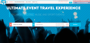
In October 2011 I left Nextup Media (sold my share to my partner) and began to search for something to work on. Eventually I came to the idea of Travelatus as something that was called “An Amazon for Travel” (we got the pitch with the initial idea here). So I turned to the guys to help me with the development and we became co-founders. I also joined SevenQuark as CMO to help them get clients to have something to live on. So in fact, the work on the project started part-time in the beginning of 2012. We tried to work on the back-end, exploring thoroughly the process of integration with Expedia API and that took quite a lot of time and effort (considering again that we had to work on clients’ projects as well). In November 2012 we turned to the new idea of focusing on event travel.

See more info on Travelatus here

 How did you find StartupYard in 2013, and how did being part of an accelerator affect your company’s trajectory in the past 8 months?

I strongly believed that an accelerator was the right choice for our company. We didn’t think of StartupYard as of the only opportunity for us, but we applied to it at the right time, I think. This was exactly the time when the project began to be something more than an idea and got its 1st prototype (it was very different from what we have at the moment but still). And StartupYard was not the only accelerator to accept us, but again they were the 1st and did it at the right time. And I’m glad that it turned out this way.

 Joining StartupYard had a great impact on our project. We got valuable advice, and living in Prague itself was mind-blowing experience. We didn’t manage to raise funding after the accelerator programme as we’d planned, but nevertheless the whole 3-month trip was great.

[SY Mentors] Ondrej Bartos and Damian Brhel influenced us most of all, I think. During talks with Ondrej the new UX-concept of Travelatus was born in fact, and Damian helped to look at the service from the point of view of a professional who is really interested in what we’re doing and looks forward to using our service.

I’m a big Prague fan as well. What about the city made your experience special?

You had a great blog post about “hacking Prague life” – some of the things that I liked about the city were mentioned there. When we speak about Prague, it’s hard for me to tell about something special – the whole city is very different from what we have in Moscow and I can’t even tell what I liked more: the central historical part of the city or Jinonice, Nove Butovice or parts around Smichovske Nadrazi. It may sound strange, but parts of the city that are not so “touristy” make you feel the real atmosphere of the city – feel that you’re part of it too.

Besides general atmosphere, it’s great to feel yourself as part of a European startup community. We have big and active startup community in Russia. However, I feel that it is a bit “closed;” too few foreigners visit Russia and we don’t have as many opportunities to visit European countries as Czech people do.

What would you say has been most responsible for your company’s growth in this short period?

I should say that we made some mistakes in regards to gaining traction for our project. As always, we thought that getting customers would be easier than in turned out to be. And getting customers was vital to getting further investments. So these mistakes did cost us a lot (as they do for many startups). Everything else was fine- the media liked us, our design and UX were called “wonderful.” But we didn’t have customers, so that all was a bit useless.

That’s such a common story. What would you do differently today to bring customers on board earlier?

When I talked with different online travel entrepreneurs (for example, with Diego Saez-Gill of Wehostels), they told me that it would have been better to start not with the service “for everyone who likes traveling to events,” but with some focus. For example, a service for people who like to travel to see events in London, or for people who are rock fans and like to travel to rock concerts. One of our competitors – Festicket – started with kind of a small niche, and rather small range of events, but then managed to grow into quite a large service offering more than 100 of festivals to travel to. I didn’t like their approach when I first saw it, but now I know that they did it right.

And that was the kind of pivot that we were thinking about before starting talks with Excursiopedia.

So it sounds like this acquisition was not your original goal.

No,  we didn’t have this as a goal. […] But then Excursiopedia offer came in and, I think, it was the right time for us to accept it in order to join a growing company (whose team, by the way, was named in top-10 among Russian startups according to rating made by Pruffi HR-agency).

One of the goals in joining an accelerator is usually to prepare for and court investors. What about your approach, or the accelerator made this goal tough for your team? What could SY do better?

I think that SY needs to work more on attracting investors from outside of Czech Republic, and making them interested in what teams in the accelerator are doing. Same for mentors, too.

The Czech market is small, and Czech investors are a bit too cautious.

I think that investor sessions should be held while teams are still in the accelerator – investors then can give their feedback and at least start following some teams. This will help them to understand their potential on Demo Day, as they’ll see what was done during the 3 months of acceleration. I don’t want to boast, but I think that we did a huge amount of work! But it wasn’t too much appreciated, as people didn’t know that it in fact took us 3 months to reinvent the UX-concept and to build the service practically from scratch.

It’s very important for startups to build their reputations in the professional community, and that it may be the way to find investments or even exits. We didn’t plan to make an exit so early, and in fact I’ll call this exit “an enter.” We’re entering Excursiopedia to help it grow into a great company. And our reputation in the online travel sphere helped us to do it (and will help us further on, of course).

We hear that this acquisition is more than a buy-out. It sounds more like a partnership. You’re becoming part of the Excursopedia team, and even moving to Munich. What do you think Excursopedia saw in your team and your service that they liked so much?

Firstly, we’ve got experience in this market that is a bit different from “activities,” which are presented at Excursiopedia at the moment. The 2nd thing was experience that is not correlated with the event tickets product itself. I have experience in building relations in the online travel and startup community, both in Russia and abroad, and this is very valuable for Excursiopedia, as it plans to expand its presence in the domestic and international market. Denis and Vitaliy are experienced developers. I should even say that they’re not just developers, but great technical teams leaders, and they’ll have the opportunity to use their skills at Excursiopedia as well (unfortunately, they didn’t have such opportunities in Travelatus).

And finally Excursiopedia is interested in developing the Travelatus project as part of the company. They like our idea of event travel and travelling with some goal in general. That’s why they’re interested in helping us to bring our service to the new level.

Would you recommend this (launching a startup) as a strategy for seeking employment? It must have been a lot of stress

I definitely won’t! And we were not seeking the job. It just happened that Excursiopedia got right positions for us and managed to offer them at the right time.

Money is not a subject a lot of founders are as comfortable with as they’d like to be. Any advice for others in the same situation?

Well, my position is that you should seek opportunities – not money – when you build your first project. We gave up 10 % of our project to SY without thinking that it was a bad deal, for example – because we gained a lot of opportunities. The main thing is that you should think about yourself  as one big “startup” – even if your project fails or you manage to make not so much money out of it. You gain experience and connections which are much more valuable. So if you see investment or selling a company as a good deal in those terms, then you should not hesitate.

What was the most valuable thing you learned at StartupYard? Something you’d want future groups to get out of an accelerator.

I see things have changed [at StartupYard}. You got a new CEO and are focusing on a smaller niche, and I think that it’s the right thing to do. So I think later groups will get even more value from the accelerator than we did.

The things that you should think of when you get into an accelerator with your project is how you will approach customers once the project is done. At StartupYard they teach lean startup concepts, but I think that it’s better to get into them before you apply, to find ways to make your application to stand out. If you write “We had talks with 100 prospective customers and 50 are ready to buy our product once it’s done”, it will certainly make you stand out, for example. For us, the most valuable things were the mistakes that we didn’t manage to avoid, but we understood their reasons and we managed to learn from them, thanks to what we learned at StartupYard.

[ssba]

Why I Agreed to be CEO of StartupYard

I did not hesitate long. But I did hesitate.

 The Challenge

An accelerator’s success depends first and foremost on the potential of the companies it helps to grow. We’ll either find amazing teams or we will not. The main parameter here is that our application forms are opening for 6 weeks starting…. Today. This means I had 3 weeks to get settled into this position, and will have 6 weeks, starting now, to recruit the best candidates for the accelerator. One thing’s for sure, if we find those hands-on entrepreneurs who combine business sense with uniquely great ideas, they will gain some fantastic knowledge during our 3 Months Acceleration Program. Still, 9 weeks (including 2 weeks of holidays), is an insanely short period of time in which to accomplish anything like this.

The Plan

However, when the Board of StartupYard told me that Seznam.cz was opening part of its proprietary search technology for the future teams, they piqued my interest even more. Suddenly we have one of the only companies in the world that is still #1 in search in its home country against Google, and they’re going to let founders build products on top of processed web data that they will collect and prepare. By providing this level of abstraction, new connections and services can be imagined within these data. It’s all down to the creativity of the founders to come up with some kick-ass business ideas. Who could say no? The second thing that interest me was that StartupYard had decided to become a specialized accelerator. From now on, every new batch of companies will all belong to a vertical segment of the IT industry. This year, thanks to Seznam.cz, it will be Data (with Search and Analytics underlying Data). That’s why this data sandbox they will make available is so interesting if you are working in these fields. Future rounds will include mobile games, payments, etc…

The Name of the Game: Data

Data

By specializing, we aim at bringing together European teams all working on similar Data problems. Our mentors work or have worked on Data projects in companies like GoodData, Google, Yahoo, IBM, Ericsson or Seznam. We see  this as a tremendous opportunity for the selected founders to learn from talented specialists. By specialising, we also hope to foster cooperation between the teams. For this reason I wanted to make sure it will be an easy decision for anybody not living in Prague to join the program. Therefore, StartupYard will offer, for the first time:

  • 3 months of free accommodations in Prague
  • Free lunch

This is important to me. It should not cost founders money to join an accelerator. Period.  If he has cash, he should use it to sustain himself while he is developing his business, or invest it directly in his company. I moved to Prague to start a business 9 years ago and I never regretted it. I want to make that decision an easy one for the next generation.

We’ll See You in Prague

I’ve been mentoring at StartupYard for 2 years now. Not all years were equal, but it is a great start-up in itself, and Prague is the best capital city in Europe. Bar none. I hope we will be able to attract some fantastic founders with brilliant ideas and give them all the knowledge and support they need to thrive. I know how exhilarating growth and success is, and how hard failure can be. I have experienced a lot working 17 years as a start-up founder and CEO. I will make sure they are ready for all of it. Applications are now open, and will stay open until January 31st, 2014. If you are working on anything related to Data, Search or Analytics, you should really check us out! We look forward to seeing you in Prague this spring.

About Cedric Maloux

Cedric Maloux director startupyard

Cedric Maloux, originally of Paris, has been in the startup world for nearly 20 years. He sold his first company in 2000, and has raised capital from the top VCs in Europe. He served as CEO of Geewa, a struggling Czech gaming company, and turned it into one of the top 10 developers for Facebook, with Pool Live Tour. He’s an avid poker player and recently launched an app for poker bankroll management. He also created Pressly.ai, a tool to instantly create professional press releases online. He has lived in Prague for nearly a decade. Cedric has been a mentor at StartupYard for over two years, and was invited by the Board of Directors this past fall to take the reins as CEO.