StartupYard Startups Reflect on Mentoring month

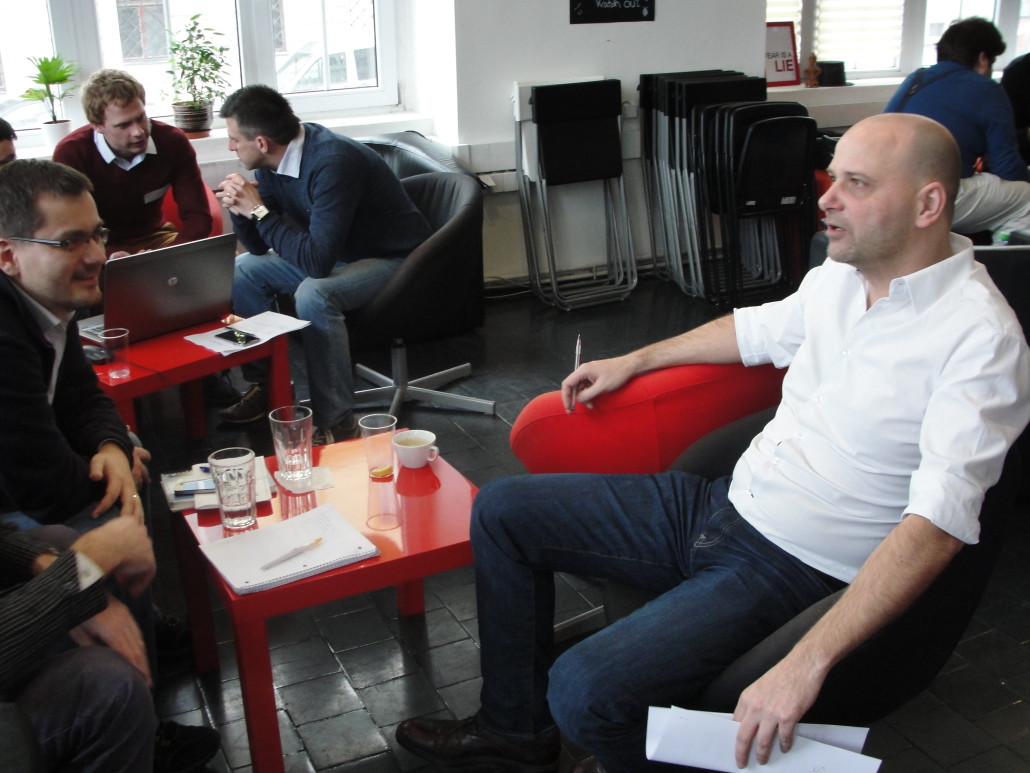
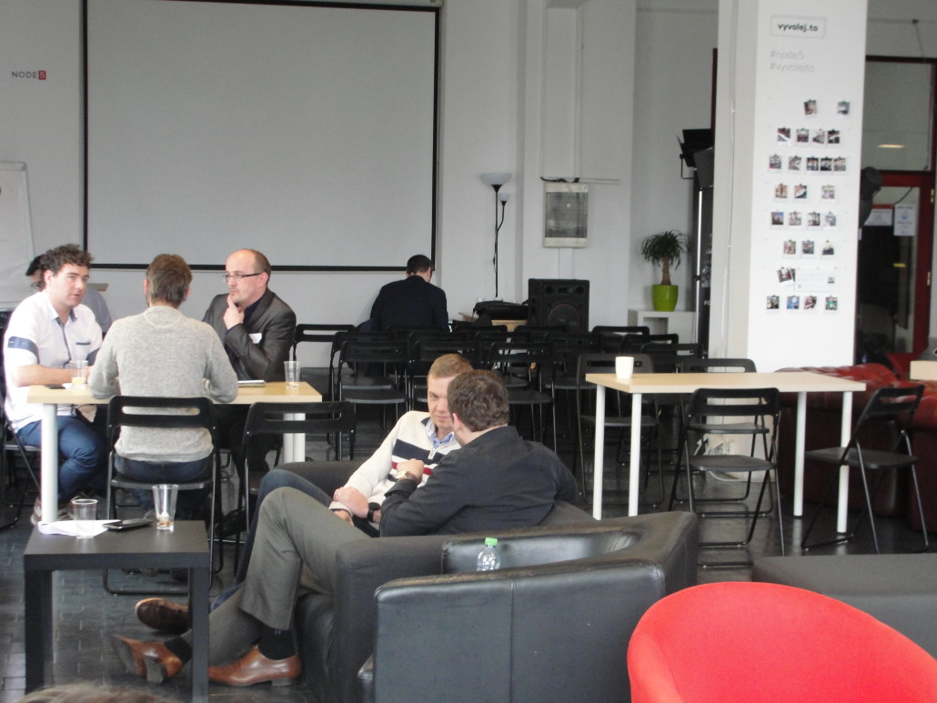
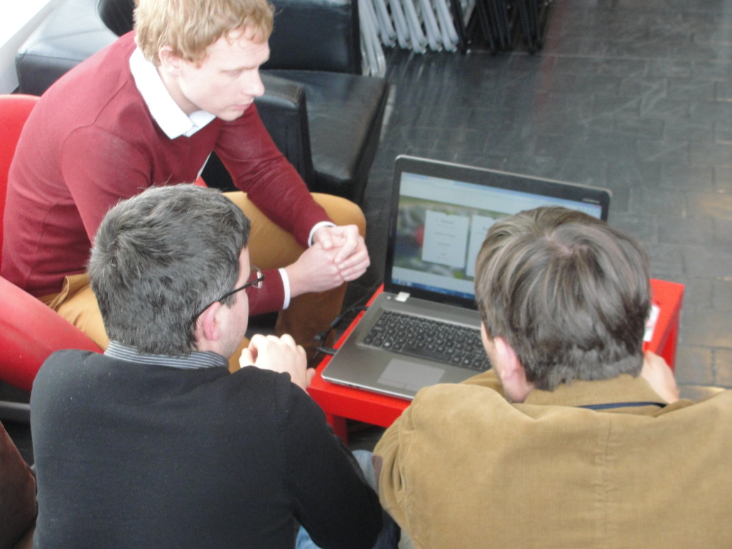
After a month booked solid with meetings between our startups and mentors, StartupYard 2015 participants have now met at least once, and often several times, with over 40 experts from a diverse range of industries.

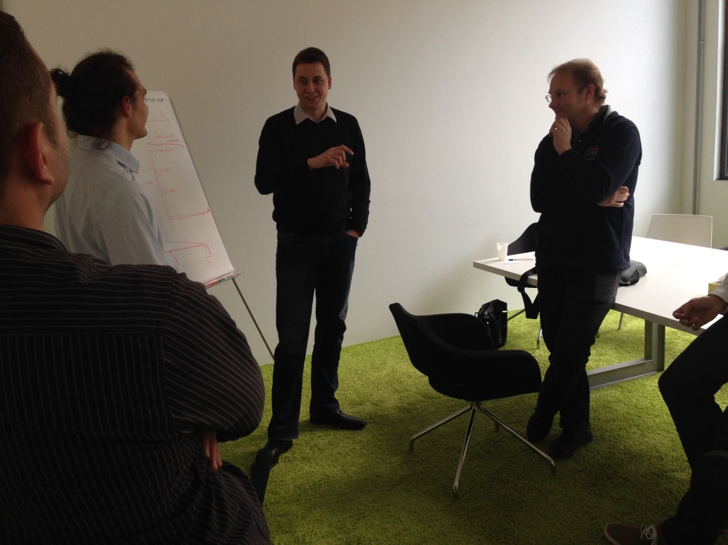
These meetings are often a blur, so we insist that startup teams document their meetings every day, noting those mentors with whom they have agreed to speak again, or who may have promised new information or connections.

The Value of Mentoring

2009-07-08 18.47.20

Mentoring at StartupYard is about more than networking. Of course, the value of networking with our mentors is inestimable. It’s certain for example, that the vast majority of the nearly $3 Million raised by StartupYard participants since 2011 came from connections made through mentors in our program.

But it’s important to keep in mind that our startups earn those investments themselves, by impressing and leveraging the mentors we give them access to. And just as important as money, mentoring sessions are real crash courses in the many hundreds of conversations that a startup is going to experience in its first year or two of operation.

It’s impossible for our startups to absorb and act upon every piece of advice they receive and every connection they make here. That’s sort of the point. On their own, startups in the early stages may find it very difficult to contextualize the various conversations they do have.

Reducing Sampling Error

Outside an accelerator, a meeting with an investor or a potential partner may be the only meeting in a week, or a month. That meeting, however it plays out, might fester in the founders’ minds for a long time, causing them to overreact to criticisms, or to become fixated on a specific piece of advice.

That one person you met 6 weeks ago doesn’t like your company name. Or he told you that you’re behind the market. Or she told you that this market is too hard to break into. Or one of a thousand other things. Or something positive, but vague: “you could be Uber for X.” What to make of that?

If the meeting is with an investor, the founders may go too far, wasting their time and energy thinking about what that person says.

I see this quite often with the startups that I mentor and meet at various conferences. I ask: “have you considered an accelerator?” “Well,” the founder responds, “we’ve been talking to an investor, so we probably don’t need an accelerator.” That might be fine if the investor is serious, and his or her vision lines up perfectly with the startups. But that isn’t always the case.

As often as not, an early investor will delay commitment as long as possible, leading the startup down a path that is interesting for the investor, but not always right for the startup. If things don’t look promising after months of talking, the investor can just walk away- nothing gained, nothing lost. The startup can’t.

Strength in Numbers

That’s a classic case of sampling error, and it works as well when it comes to individual meetings, as it does for ad campaigns and landing pages. You need a lot of data to make anything but a gut decision.

Startups used to get that data the really hard way. They would collect over years of iterating the same mistakes, and going down dead-end roads, with investors, partners, and strategies. But that’s a process few startups can afford to go through, and it leaves a lot of great ideas on the table- dead only because the founders didn’t have the time to try that one last thing that might work.

Accelerators solve that problem, by condensing this string of dead ends, self-doubts, insights (and false insights), and breakthrough meetings into an intense, but survivable period.

Reflections

I polled our current startups with a few questions about their mentoring experiences this past month. Here are the questions, and a selection of the answers from all 7 of our startups:

What’s one piece of feedback you have heard most often from the mentors? How have you responded to this feedback so far?

Cindy Dam, Marketing: TeskaLabs

IMG_1645

Cindy Dam

“We talk about security and protection, assuming that it is obvious what we’re protecting. However, many mentors asked us ‘what are protecting, and from what?’ They were still not convinced when we told them about potential security breaches and hacks. 

Now we also mention the possibility for the customers to see reports of security-related events happening on the servers, as a way to back up our claims. Mentor Wallace Green from Cap Gemini gave us that idea and showed us how it could work.  Mentors then started to consider and accept our arguments. With those changes, it started making sense as a product that can sell itself, and that’s something we hadn’t considered necessary.” 

Elle Sidell, Copywriter: Testomato

The testomato Team

The testomato Team

“We’ve heard from a lot of mentors that we need to strengthen, or possibly change, our unique value proposition and simplify the way we introduce users to Testomato. These discussions have led our team to change our target group from developers to e-commerce companies.

So we’ve simplified the wording on our website, and provided clearer descriptions about what we offer and how we can help.

We’ve also cut down the amount of emails that we send to different users (i.e. different emails to different roles within each account), and we’ve created a new Application Dashboard to encourage customers to use more features when configuring tests or setting up website monitoring.”

Jaromir Dvoracek, Co-Founder: Trendlucid

wEIkyiz7

Jaro Co-Founder of TrendLucid

“We started with a name that was really similar to another company in the same space. So much so, that some mentors thought we actually were the other company.So we really needed to define our brand.

After a lot of trial and error, and especially the help of  mentor Liva Judic, we stumbled on TrendLucid. And that was it! We’re TrendLucid now.

Part of the learning process was discovering that the name didn’t have to be that appealing for the Czech market, which we worried about too much before. The Czech market isn’t the end of our long term plans, and we needed a name that makes sense globally. We have very good feedback for the TrendLucid brand so far. Especially from English native speakers. So it’s working!” 

Jan Muller, Co-Founder: BudgetBakers

IMG_1659

Jan Muller of Budget Bakers

“A common question was: ‘do you have automatic data input?’ That’s something that is now available in some markets, like the US.

The mentoring process convinced us that this needs to be a main focus in the near future. We have already added an automatic bank statement importing/parsing tool, which reads users’ bank statements and adds them to the budget. We are starting conversations with Czech banks so we can eventually access user data through public APIs. In 2 years, all the European banks will have to make those APIs available, so we need to be ahead of the curve.”

What is the single best piece of advice you have received so far, and why? What did you do about it?

Ales Teska, Founder: TeskaLabs

gvowapAl

Ales Teska, Founder of TeskaLabs

“If I have to pick only one most valuable piece of advice, it has to be a ‘marketing crash course’ from Jan Habich. He explained how we should introduce our product in our materials. He actually completely reversed our point of view.

It is simple as this: 1) “What is it?” (simple statement), 2) “Is it for me?” 3) “Why should I trust you?”. Our new website follows this and works very well (on test subjects) and all our new marketing communication is built around this.

We now start talking about the pain/experience of our customers and only after that do we go into feature walkthroughs if needed.”

Máthé Zsolt-László, Co-Founder: Shoptsie

IMG_1587

The Shoptsie Team: Ordog and Mathe

“The best advice we have received is that, at the start, we should focus more on customer acquisition to get the critical mass of customers with which we can test our assumptions, and not to bother with the pricing module.  Rumen Iliev, Andrej Kiska, and Wallace Green especially advocated this approach.

After we do this,  we can test multiple pricing models and choose the most suitable to our customers and also for our business. Also, when we have achieved the growth of our customer base, we can easily create planned marketplaces from which we also can make income. 

One another good advice was that in time we should focus on other industries, like digital goods, lifestyle coaches. Advices given by  Liva Judic and Daniel Hastik

Ondra Cervinka, Co-Founder: Myia

IMG_1589

On the left: Ondra from Myia, and Ales Teska, of TeskaLabs.

“Concentrate on building the user base. If you have big user base, then the business model becomes obvious. We are looking for cases where the owner of Wi-Fi will suggest or require that people install and use Myia.

We plan to add affinity functions that will influence the users to keep using the app.”
Meet Portadi: The Czech Startup Making Group Logins Easy and Secure

So much of our work is in the cloud these days, especially at StartupYard, that one of the biggest headaches we used to experience, on an hourly basis, was maintaining our browser sessions with an ever-expanding list of cloud apps to log into. When we need, as a team, to be able to check Twitter and Buffer, copy something into our WordPress, then link a blog post to a mailchimp template, while also suddenly remembering to finish that eventbrite…. well, having to lookup our passwords on a spreadsheet is not only unproductive, but maddening.

And worse, that spreadsheet is not particularly secure- particularly if it’s disseminated via email, and sits on every computer in our team. What if one of the team members were to leave one day? It would take us weeks to change all those passwords, and meanwhile, they’d have access to all our cloud apps. They’d have the keys to everything. No more of that. Introducing Portadi: the secure cloud access tool for teams.

 portadi-logo-505-100

StartupYard has been a pilot user of Portadi since this past autumn, and we’ve been impressed. I caught up with Co-Founder CEO Dusan Vitek, who started Portadi Co-Founder and CTO Tomas Soukup, to chat about the tool, and their future plans as a company.

Dusan Vitek: Co-Founder and CEO of Portadi

Dusan Vitek: Co-Founder and CEO of Portadi

Hi Dusan, tell us a bit about Portadi. Where did the idea come from? 

The cloud is a huge construction site. It looks like Berlin nowadays, there are cranes everywhere. In my last team we had about 50 cloud apps and accounts, almost everything we touched was in the cloud. It took a frustratingly long time to set up a new hire or freelancer properly and it was even harder to disconnect people from everything. For all of us who rely on cloud apps, wouldn’t it be cool to have all business accounts in one place from day one, ready to go? That is not happening in most organizations today. I knew we can fix that for a lot of teams around the world and that’s why we started Portadi.

 The StartupYard team has been using the app for a few months, and we love it so far. It saves me at least 15 minutes a day when I’m using it. How does it compare with some of the other team password tools on the market?

We aim to remove passwords from our workflow”

viewing which team members access which apps

Team overview of app access

logging into cloud apps with a single click

Log into shared  cloud apps with a single click

Password managers are a duct tape. They all have been designed for individual users to help them store their credentials. We don’t see it that way. We aim to remove passwords from our workflow. Portadi is an access panel for cloud apps, your VIP entry card for workplace apps.

Portadi saves you time because it’s your personal gateway to all workplace cloud apps. Portadi saves you money because it shows how much your paid subscriptions are used. Portadi gives you security because it eliminates login credentials for 50 work apps and replaces it with a single set of credentials for everything. 


Will Portadi stay a small-business solution, or do you plan to target larger companies as well? 

We’re designing Portadi for workplace teams. App management is not just a problem of small companies or large companies. It’s a common problem in any team that relies on third-party cloud services like Salesforce, Office Depot, or your hosting provider.

Large companies are being served by other identity and access management vendors like Microsoft, Oracle or Computer Associates. They mostly play in the on-premise market but have weak offerings in cloud app management. 

But large enterprise customers are not immune to the cloud. Yes, three years ago if we got a meeting with a large vendor, we would go home with a 100-page document listing all of the requirements we had to fulfill. But that has changed. In most cases what they buy as a service is an app, it’s not infrastructure.

Where passwords are concerned, security is always at the front of people’s minds. You expect customers to share their logins for key social media accounts, and other sensitive access information. What kinds of measures do you take to make sure the platform remains secure?

We have 13 years of security experience building host-based and gateway firewall products so we take security very seriously. Application credentials are encrypted with AES 256 before we ever store them in the database. All communication between the Portadi secure cloud and Portadi browser extensions is encrypted using TLS. We audit all access attempts to the Portadi cloud and scan for unusual behavior. And we offer 2-factor authentication into Portadi which by extension we provide to all services that you access through Portadi. 

So by using Portadi, a group can potentially increase the security of their passwords?

Yes, you can keep your passwords secret. Instead of giving your new colleague 50 passwords for 50 different services, you give her just one password and one Portadi access panel. She won’t know the passwords for any of those 50 services, Portadi will be her only gateway. It totally rocks for shared passwords because any change affects many people.

As simple as Portadi is, do you think it will be a challenge to monetize? How have you gone about tackling this issue?

We are a freemium product, you can start for free. The service costs $2 per user per month. It was important for us to test pricing early on and while some people think it’s inexpensive, most customers tell us that the price is fair. We rolled out the paid plan in February this year and got first paying customers that month. Portadi saves a lot of money and headaches for customers who use it.

Tell us a bit about the Portadi team. 

Tomas does the coding, I do everything but coding. I think what makes us a really great team is the shared passion for great products and delightfully simple user experience. Tomas likes things pretty straight up and to the point, I – being a marketer – tend to elaborate more. We find a happy medium most of the time.  

We hear that you’ve just started an accelerator program with Microsoft. Can you tell us anything about that? 

Yes, Portadi got into the final elite group of eight startups who joined the Microsoft Ventures Accelerator in Berlin. There were over 500 startups trying to get in so we are obviously very happy. Microsoft provides office space, mentorship, credits for Microsoft technology, access to venture capital, and the all important foosball table. Oh, and just the other day they got us new gigantic desk lamps which look like construction cranes. Somehow it’s quite fitting with the whole Berlin scene.

Are you currently looking for investors? What’s coming next in Portadi’s development?

Yes, we are open to partnering with investors who understand our business. But right now we are heads down building an awesome product. Most of our customers are on Google Apps, so we’re exploring some tighter integration.

StartupYard’s Next “Unconference,” Tuesday, April 21st, 18:00, Sponsored by SoftLayer

StartupYard is happy to announce our second “Unconference,” a non-programmed networking and thought-sharing event in which anyone can be a presenter, and where ideas matter more than personalities.

The event will be held at StartupYard’s homebase:

Node5, Tuesday, April 21st, at 18:00. 

Anyone with an interest in Startups is more than welcome to attend, and to present on any related topic, or just to listen and ask questions. Drinks, and light refreshment will be provided, and the event is expect to run until about 21:00

Register for The Next StartupYard Unconference


Sponsored by SoftLayer

We are also please to announce that SoftLayer, an IBM company, is graciously providing food and drinks for the event, through our partners at Node5. SoftLayer is a proud StartupYard sponsor, and will be giving a workshop on integrating IBM cloud services for members of StartupYard and Node5 on April 20th. Their participation in the UnConference brings their authoritative voice on cloud computing and big data solutions to any of the sessions they may host or attend. We’ll be happy to have them there!

From their website:

“SoftLayer, an IBM Company, provides cloud infrastructure as a service from a growing number of data centers and network points of presence around the world. Our customers range from Web startups to global enterprises.”

l91276-softlayer-logo-73816

How it Works

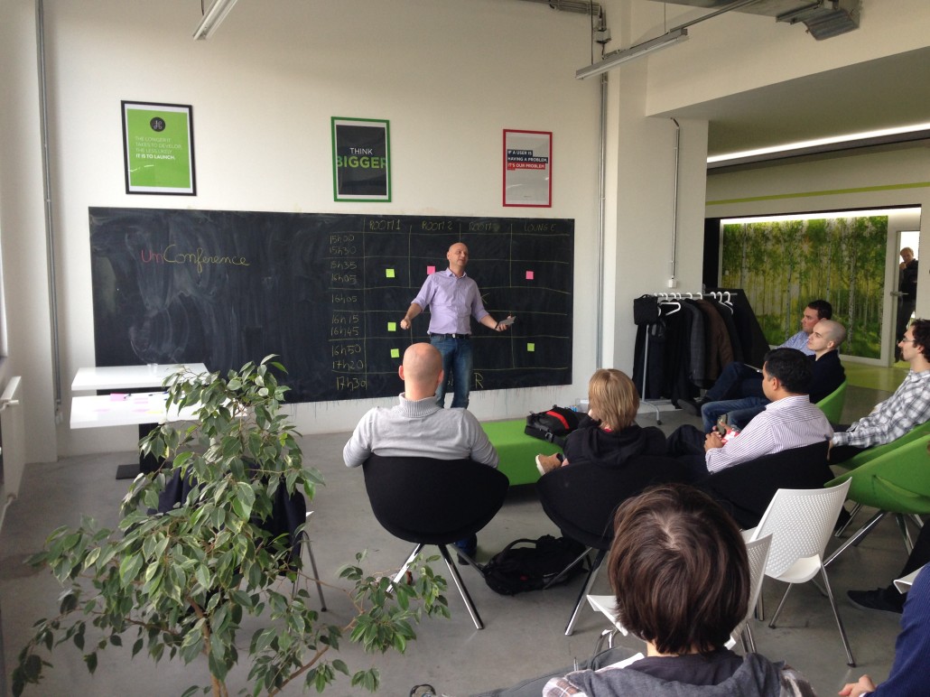
Last year,  our director Cedric Maloux ran our first “Unconference.” For those as yet unfamiliar with the format, as I was myself, unconferencing is an alternative take on a conference in which the participants help shape the talks and sessions offered.

An Unconference differs from a traditional conference or set of workshops, chiefly in that none of its content is planned or scheduled ahead of time. Instead, the content of workshops is decided spontaneously, by whomever is in attendance, and is interested in contributing.

IMG_0511

Cedric Maloux introduces the Unconference concept

The whole process looks a bit like this:

1. Introduce the format to attendees.

2. Attendees write down a workshop topic they would like to host or to attend on sticky notes.

3. Participants vote on the topics to be included in a series of 3 time slots, with 3 worshops running simultaneously, for a total of 9 (this depends on the needs and size of your Unconference).

4. The moderator proposes a schedule of the events, striking a balance between topics, and not putting the most popular workshops in competition.

5. Attendees suggest changes, and the conference kicks off, with the topic owners either presenting themselves without preparation, or asking for others to present on the topic they’ve proposed- in some cases, workshops become idea-sharing and brainstorming meetings.


Why it Works

Unexpectedly at our last Unconference, I ended up leading a session myself in the first time bracket, on email marketing, a subject close to my heart. My talk was “The 7 Elements of the Perfect Marketing Email.” As the idea had popped into my mind at the last moment, I had written it into the schedule expecting only a few people to be interested. But about a dozen people arrived to hear me speak about a subject for which I had not prepared any material.

No matter, I forged ahead and proposed a few of the ideas about what I think makes great email marketing. And here’s the best part: because of the informality of the format, and the time constraints, the attendees were quick to prod me with a bunch of questions I had no hope of ever being able to answer completely in the given time. These questions gave me great insights into what they wanted out of my talk. For example, someone asked whether he should send mass emails to his top clients using his personal email address, and if so, how to make sure there were no embarrassing gaffes with names and personalization. That’s a question I wouldn’t think to talk about with that group. But because it was an unconference, the people who attended my workshop were quick to tell me what they wanted to talk about.

IMG_0513

Conference attendees move from discussion to discussion.

Clearly, the unconference is a great platform for launching dialogues and connecting with peers who have skill sets you may not even know about. I found myself spending the remainder of the evening reviewing my comments, and cursing myself for not adding *that* piece of information, or *this* anecdote to my talk. It inspired me to flesh out my own ideas on the topic, and the questions honed in on what interested my workshop group most.


What You Can Get Out of It

A big drag on conferences, it seems to me, is that much of the time, they’re vehicles for a few people to brag to each other, in front of an audience, about how successful they are. Conferences are often more about the people who’ve organized them, than the people attending. An Unconference is all about the people in attendance. Based on our experience last year, an unconference can prompt questions and debates that last for quite some time, and may spark connections with other thinkers and idea makers who you’d normally never get a chance to engage with on the same level.

Presenting the StartupYard 2015 Startups

logocentered

Following an open call that attracted over 200 applications from across Europe, we launched our 2015 Accelerator round less than a month ago. Today, 7 companies, 6 of them from The Czech Republic, have completed nearly a month of intensive mentoring, and are ready to be unveiled for the first time.

Read the Forbes.cz Exclusive (In Czech)

This crop of new companies represents StartupYard’s most advanced cohort to date. Not only do most of the below listed startups already have MVPs, but several even have their first customers.

Together with a fantastic group of mentors, including new faces from Y-soft, Microsoft, Google, Skype, and our partner Mazars, we’ve taken StartupYard to a whole new and exciting level this year, and it’s an incredible pleasure to share the news with our community.

These Startups will Present Publicly at The StartupYard Demo Day, May 28th 2015 in Prague  


The StartupYard 2015 Teams Are:


bb-highres_1024

BudgetBakers.com: Czech Republic

Wallet by BudgetBakers, is for individuals and families who worry about not knowing where their money goes. Wallet is a friendly, easy-to-use, mobile and web-based budgeting platform that provides a simple, comprehensive financial dashboard in a clean and intuitive environment. So far, the Android app has been downloaded over 700,000 times. The iOS version is coming soon.  

Shoptsie-logo

Shoptsie.com: Romania

Shoptsie is an intuitive and free online store creator, for indie crafters and fashion designers who don’t know how to sell online. Shoptsie allows anyone to create and embed an e-shop on their Facebook page or website, without any coding skills. There are currently over 700 shops on Shoptsie, with more than 3 added per day on average.

teska4 

Teskalabs.com: Czech Republic

Teskalabs provides enterprise grade security solutions for industrial and consumer mobile applications. Teskalabs offers a plug-and-play information security platform for any connected device via software, hardware and/or SaaS products, based on industry best practices. TeskaLabs’ customers include British Gas, NetworkRail, and DHL Supply Chain.

url

Testomato.com: Czech Republic

Testomato is an advanced monitoring solution for online businesses that can’t afford broken functionalities on their websites. Testomato is the world’s easiest automated testing service, monitoring your website in real-time and alerting you when something doesn’t behave as expected.

MyiaWhite01

GetMyia.com: Czech Republic

Myia is for businesses that provide free wi-fi access and are looking to give some added-value to their customers. It’s a communication platform that turns any wi-fi hotspot into a broadcasting channel. Myia is currently in private beta.

trendlucid

TrendLucid.com: Czech Republic

TrendLucid is a market evaluation engine for e-shop owners who don’t know which particular products people are buying. It aggregates current consumer and market data, including reviews and pricing, and provides e-shops with sales projections for different products in any particular category. TrendLucid provides up to the minute advice on market trends and popular products, in an easy to use visual datamap.

StartupYard Partner Mazars Publishes Guide to Business In The Czech Republic

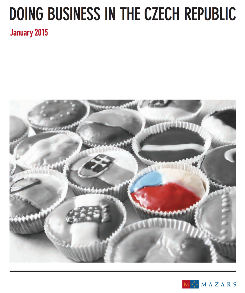
The international finance consultancy Mazars, a StartupYard partner, has published a guide to business for foreigners in The Czech Republic. The guide covers areas of international investment, EU grants, Tax law, immigration and labor laws, auditing, and incorporation.

mazarsguidetoczech

Founders of Slevomat, DameJidlo, and CZC.cz Invest In StartupYard 2015 Program

StartupYard is pleased to announce that Josef Matějka, founder of CZC.cz, and Slevomat founder Tomáš Čupr’s Bizthusiasm investment company have come on board as investors in StartupYard 2015.

They join Credo Ventures, Michal Illich, and Petr Ocásek, as backers of the 2015 startup cohort. Both Matějka and Čupr have taken an active role in this cohort since the end of 2014, as members of the selection committee. They helped reduce a pool of over 200 applications to just 7 startups, the names of which will be announced publicly next week.

Josef Matějka is the founder of CZC.cz, the Czech Republic’s 2nd leading electronics and IT equipment e-retailer. He expressed his hope to us this week that tech founders of his generation will begin to give back to the Czech startup ecosystem: “Investment in the Czech Startup scene is important, because it supports a creative environment, and the realization of good ideas.” Čupr also expressed the need to give back: “Globally and locally competitive and successful Czech startups benefit all of us,” he said.

Čupr has been involved in one way or another with StartupYard since before his acquisition of DameJidlo’s predecessor, PizzaTime, from the StartupYard 2012 cohort. Čupr transformed that company into a major success, selling it earlier this year to German delivery giant DeliveryHero. Čupr bring years of experience in e-commerce to StartupYard’s mentorship program, having also founded Slevomat, the highly popular Czech coupon platform, and invested in Rohlik.cz, the newly redesigned Czech grocery delivery service.

Čupr is enthusiastic about the StartupYard program. He said this week, via email: “I’ve been following StartupYard for several years, and each year their work has been better and better. I believe in the experience and abilities of their team.”

StartupYard Managing Director Cedric Maloux was extremely pleased with the development, saying: “It’s fantastic to see successful local entrepreneurs stepping up to support this ecosystem, without being averse to risk. The Czech Republic needs more role models like Čupr and Matějka to inspire and support the next generation of Czech tech founders.”

StartupYard’s 2015 cohort will publicly present themselves for the first time at StartupYard Demo Day, on May 28th of this year, in Prague. A press release detailing their names and areas of business will be released next week.


What Launching 15 Startups has taught me about “Design Grammar”

“That’s the same homepage everyone has. It’s boring.”

I hear this quite a bit. As our first month of mentoring for StartupYard 2015 rolls along, we have 7 companies preparing to soft-launch their services and products, mostly with new branding, and some with entirely new names, over the next few weeks.

And we have this kind of conversation a lot. As they pick a name and take their first stabs at branding themselves, most of our startups suddenly become ambitious about their marketing language, site design, and logos. I love to see it, really, because it’s a sign of keenness to be bigger, better, and newer than the competition.

As they’ve all been working on their positioning statements for the past few weeks, and have gotten more comfortable with their value propositions, their go to market strategies, and their growth predictions, our startups start to feel that they’re experts on their own brands. As they hear more about calls to action, marketing campaigns, and branding generally, they start to get the itch to experiment with their own theories about their would be customers.

I find myself, on the other hand, being constantly discouraging; constantly talking about “consistent visual grammar,” and the “grammar of your design.” This often elicits blank stares of incredulity. What is “design grammar?” And why do we need that? Our Executive-in-Residence Philip Staehelin suggested to me earlier this week that I write a blog post to try and explain. This is that blog post.

The Great Sameness

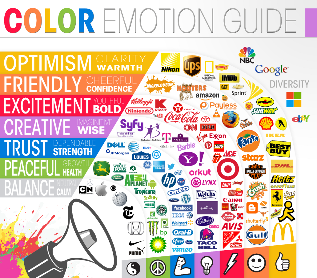
Color_Emotion_Guide22

Image by The Logo Company


A big part of this settling-in process is our startups exploring the branding of their competitors. They browse websites and check pricing and features, and they get used to what the market is focused on, looking for their edge. Our mentors also suggest competitors and potential partners they should look at, and the startups get very well versed in their market.

And then, it all gets a bit boring. We have a startup that is working on a competitor to Shopify or Volution, for example. Check out those two sites, and you won’t be surprised by what you find. Some variation in the choices of headers, a different call to action: “start for free,” instead of “get started,” or “get started now,” or one of 10 other possible variations. On the surface, they’re much the same.

Whether it’s B2B or B2C, a SaaS or a consultancy, the web has been taken over by a sameness in the way online companies communicate through their websites. Why is that? And why would that be a good thing?

Boring is not Boring

The answer is not sexy. As VWO points out, it’s because landing page design is more science than art. Companies with huge volume in SaaS products, like MailChimp, Mint, Shopify, Slack, and Dropbox, all use essentially the same layout for their homepages, and similar layouts for campaign landing pages. These pages have been tested, tweaked, and perfected using the collected data of tens of millions of visits to similar sites.

Companies with high inbound traffic pay expensive consultants, or use tools like Attensee or Optimizely, to collect fairly precise data on exactly how each piece of text, each image, and each particular call to action performs best- and they have the ability to tweak the site’s appearance for different regions, and even different types of users, to maximize the site’s conversion rate.

We seem to be arriving at a sort of paradox. We know, scientifically, which sorts of things work (or at least don’t fail) on landing pages and home pages, but that makes a lot of these sorts of pages look the same. Boring and safe is the rule. So their boringness, seemingly, would mean that they wouldn’t do as well as they do, because they’re not special. And yet, if they didn’t perform well, they would be changed. So what’s the deal?

Impress Me, but Don’t Surprise Me

This sort of thinking is the sort of thing that many startups struggle with early on. They begin to believe that “different,” and “surprising” are the same as “good,” and “effective.”

A sales director I worked with early in my career gave me a sound piece of advice that I’ve always remembered. He said this:

“If I asked you to show me 4 fingers, what would do?”
I held up 4 fingers on one hand.
What if you held up two fingers on each hand?”
I hadn’t thought of it.
“Wouldn’t that be weird? When your customer gives you their attention, like clicking on your website or signing up for a newsletter, they are usually asking for information. They are not asking to be surprised. They are asking to be persuaded.”

There are many ways to hold up 4 fingers. However, his point was that doing something a customer doesn’t expect, even if it *is* surprising and impressive, is not necessarily going to make them trust you, or buy from you.

A “surprising” website, with a novel design and fancy layout, may make an impression on your prospect. But that impression is as likely to be: “this company is clearly good at making impressive websites,” as it is: “I trust this company to do whatever it is they are trying to sell me.”

Holding up two fingers on each hand might make someone think. But it might make someone think: “this guy is an asshole.”

Rather, “impressiveness” that translates to someone actually buying your product, is found in your descriptions and demonstrations of the product itself. The product should be impressive. The way you talk about the product should be in view of that impressiveness.

If you have a product market fit, then your marketing of your products should get out of the way as fast as possible. And the best and easiest method of getting out of the way, is using a visual design, a way of doing things, a “grammar,” that your prospective customer is likely to be familiar with.

Wanting a “creative,” and “different” website is natural. You want to be different. But “being different” about the way you present your products -if they are good products that the customers actually want to buy- is usually going to be a waste of your, and more importantly, the customer’s time.

Think about it. When you walk into a car dealership, you look around for the person who can answer your questions about the car. You expect that person to be in a suit, maybe with a nametag, so that you can recognize him or her easily. If someone came up to you in cutoff jeans and a bolo hat, smoking a cigar, you’d certainly remember that. But would you want to buy a car from them?

My guess is no. Because you didn’t come into the shop to appreciate a creative salesman. You came into the shop to appreciate and learn about a car you’d like to buy. The salesman wears a suit because he doesn’t want to distract you from doing exactly what you want to do anyway.

That is where the sameness of design comes from. As products get better, more specialized, and more powerful, the trappings of how we talk about them, and how we present them online actually get more straightforward. As we are all more comfortable with the ideas and the types of products we are discussing, the need for bells and whistles slowly diminishes.

A Mature Market Means a Shorter Sales Cycle

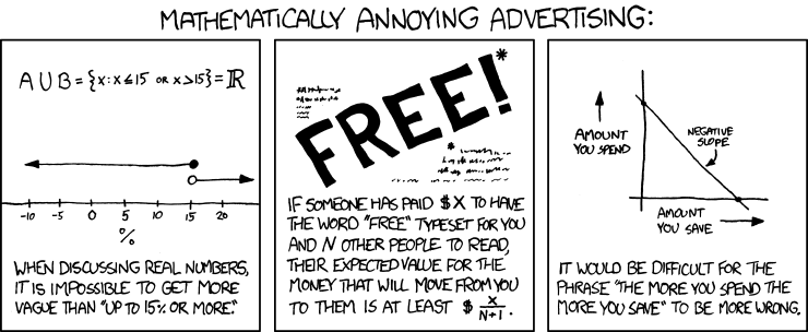
mathematically_annoying

My father once took me with him to buy a car, when I was a little boy. This was in the early 90s. The salesman called the morning of the visit, and we spent hours talking with him about the cars my father was looking at. He took us to lunch, and on a drive in the car my father wanted to buy. They went through pages of options for the car, discussing all of them. They haggled some more, and they had coffee. They discussed financing. We spent 6 hours at the dealership.

This year, 25 years later, I bought the first car I could call my own, for my own family. The saleswoman was pleasant, and offered me coffee. The meeting took less than an hour, including the test drive.

Why? Because I had spent time at home configuring the car I wanted to buy on the company’s website. I had printed out the options I wanted, so when I got there, the deal was practically done already. She gave me a few pieces of advice, trying to upsell me on a few items. That was about it.

A car salesmen of a century ago would have been expected to take their clients to dinner, visit their homes, and work a sale for days or weeks. That was done because customers weren’t familiar yet with what they were buying. Trust in the dealer translated to trust in the product. But today, a Google search is a click away. Trust is statistical; scientific.

The web has followed a similar evolution: today, people expect the sales cycle to be short, and they’ll punish you for making them jump through any hoops. Every step between the customer and the content, or between the customer and the purchase, is a step that some customers would rather skip, and a step that is likely to diminish trust, rather than enhance it.

Clean and Frictionless are Two Separate Qualities

In our last cohort, one of our startups showed me a landing page that was nothing but an image, and a headline with a provocative question. It was something like: “Do you believe in True Love?” There were two large buttons: Yes, and No.

“Ok…” I said. “And now what?”
“Well,” the founder said, “It inspires you to click on it to give your answer.”
“Ok,” I said. And I clicked “no.”
Another text appeared: “Are you sure?”
:Facepalm:

I got what he was trying to do. Our generation has been raised on a diet of “interactive,” that promotes the idea of interaction without actual engagement with anything. It’s a ploy. Like having a popup in a video game that says: “press X repeatedly.”

But at least in a video game, the designer would be trying to trick you into feeling like you’re having fun after you’ve bought the game. We can tolerate trickery of this kind. It’s expected, and we’re already invested in the product. But for a landing page?

First, the visitor has already clicked a link or entered a URL to get to the site. That’s 1 action. Now they’re being presented with an “activating” action that doesn’t accomplish anything they haven’t already decided to do.

Would the prospective user be much more likely to download the app or buy the product after being activated twice? Not likely. Would the person who clicked “yes,” then be significantly more likely to download the app, than that same person would have been, if they had not been “activated” in this way? I don’t think so. And there would be no way to test it anyway.

Second, this sort of landing page is a conceit that people recognize for what it is. But whereas we’ll accept this kind of trick in a video game as part of the experience, a landing page has no “buy-in” from a visitor that ensures they’ll put up with your nonsense. They would have to click to get to the site, then click “yes,” and only then would you even get a chance to persuade them to buy or look at or download something.

That’s like making your prospective car buyer pay for a test drive. Only a highly motivated buyer would bother. I told the founder that if he did that, he could expect a >50% bounce rate on the landing page, and no positive effect on the bounce rate for the homepage it was linking to.

He launched the page and payed for Facebook ads, and the bounce rate was high as I had predicted, with no effect on the download rate for users who passed the first design hurdle. So he took the page down, and let users go right to the homepage. Lesson learned.

From Design to Content

Design in any mature medium, over time, becomes less baroque. Less “unique” in broad strokes. People learn what works. Everything gets to be more shorthand, and conventional. Gone are the salad days of edgy web design, with MySpace pages and GeoCities domains, replaced by white space, edge to edge. The new watchword for web design best practices is “clean,” not “shiny.”

Take a look at a prime example of an historically “edgy,” homepage, that has become progressively more conservative over the years. There’s a good chance you’ve visited. It’s Apple.com.

Do you sense a trend here? Discounting its first few iterations, which reflected the lack of clear web design principles in the age of GeoCities (and clearly before Apple considered e-sales to be vital to its strategy), the site had a “brochure” layout that was common in its time. The first web designers were, after all, magazine and textbook publishers, and those design principles migrated from the older media.

What’s interesting is when Apple introduces, around the time of the release of OSX, an “OSX Skin” for its websites. Here, the company is clearly trying to impress the visitor with the overall visual appeal of its operating system: a taste of what you’ll get when you buy a Mac.

In today’s terms, then, this would be like turning the Apple homepage into the screen of an Apple Watch or a mockup of iOS, and making the visitor navigate the operating system, to see how impressive it is. Surprising, yes. But would that be a boon to sales?

As we push forward in time, Apple stubbornly sticks to its “Mac Os” skinned visual design, but the design departs further and further from the actual contemporary operating system. The design settles, starting in the late 2000s, into a hybrid of the magazine and top margin button layout that we’re all familiar with. It’s sleek, it’s Apple, but it’s also ordinary. You know it when you see it.

While we can be sure that Apple actually had a hand in making this the prototypical design for most tech company homepages, we also see that once it’s set in place, it dithers less and less, and experiments become less frequent. We have found something that consistently works. The design has become the background. Our focus is on the content of the pages.

Design is the Background: Content is Everything

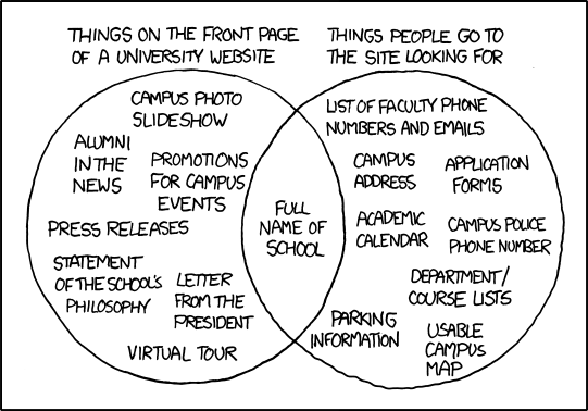
university_website

As our experience of the web has fragmented between tablets, mobile, browsers, apps, Social Media platforms like Facebook, the individual “design islands,” that used to constitute individual websites, have become more and more difficult to distinguish.

Publishing platforms like Medium or even Wikipedia do away with as much design as is possible, leaving only room for the content they contain to be found, catalogued, and displayed.

So, “impressive” design has become anathema to the web experience, as the quality and volume of the content available on the web has increased. We don’t want people looking at our websites anymore. We want them going straight to our content and products.

Because unlike 15 years ago, our content and our products can sell themselves; people are familiar with the notion of online business, and they don’t need to be reassured, they need to be given frictionless access.

The web has transformed from a “global village,” of boutique shops, to an expo, where everyone has essentially the same amount of space to display their wares: and the quality of their offerings determines everything.

That fragmentation and decentralization away from home pages can be seen in many places- particularly in SaaS products. How many people who use Dropbox actually go to Dropbox.com?

Instead, Dropbox has made itself integral to many of the things people do all over the web. Likewise for Twitter. I doubt that many web services 10 years ago would have imagined that they could activate and maintain customers, for years, without those customers having to bother ever visiting their websites.

Increasingly, traffic and eyeballs are concentrated on a handful of central platforms like Facebook, Google, or Reddit, from which the majority of readers browse the content of other pages.

This is becoming true of e-commerce as well, with e-shops being migrated directly onto Facebook. There may come a day when launching a successful SaaS will not even require a dedicated website. That day may be sooner than you think.

Why This Makes Design More Important

You may have concluded by now that I mean to suggest that the grammar of your of your site design, your product design, and your marketing are becoming less important. On the contrary. As users become more and more fluent in up-to-date principles of web design, they become attuned to deviations from the norm.

That attunement can be to your detriment if your design is sloppy or jarring. Or you can turn it to your advantage, by trusting your site visitors to follow clear, consistent, and focused visual and messaging cues. Trading flash for subtlety is just the first step.

StartupBootCamp Smart Transportation & Energy FastTrack, April 9th

StartupYard is pleased to announce that our friends StartupBootCamp, the Berlin based accelerator, will be visiting Prague soon!

On April 9th, Startupbootcamp Smart Transportation & Energy will be in in Prague for a “FastTrack” event, meeting with local startups who are interested in getting funded, and attending the Berlin based accelerator. Startupbootcamp is looking for cutting edge projects in smart transportation and energy.


Sign Up Now to Be A Part of StartupBootCamp FastTrack


Hosted by StartupYard’s homebase, Node5, FastTrack is the perfect opportunity to pitch your idea to experienced mentors, gain feedback and do networking, while learning about Startupbootcamp’s top­ notch accelerator program. If you are interested in joining the 2015 Startupbootcamp Smart Transportation & Energy Accelerator


StartupYard 2015, Week One: Feature, Product, Company

StartupYard is now officially underway, and our cohort of 7 exciting startups have now joined us at Node5, to begin an intensive month of mentoring.

How it works


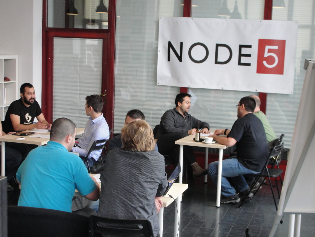
Typically, our mentoring days are hectic. Startups have to study and think about who they’ll be meeting with beforehand, so they’re prepared for many different kinds of conversations in the same day. We require our startups to be present and ready to meet with mentors, who come in during the morning, and begin meeting with the companies one-by-one. They meet with meetings can run as short as 20 minutes, or as long as an hour or more, with some mentors and companies never really wanting to suspend the discussion. Each mentor comes into the experience with different motivations and priorities. Most have backgrounds or a great deal of experience in business, sales, and marketing, and that can be a big challenge for startups that are usually dominated by technical founders. But as we like to tell our startups: you can teach an engineer business skills much more easily than you can teach a businessperson to think like an engineer.

The job of the startups, and particularly their CEOs, is to be like a sponge, absorbing not only what the mentors have to say about their products, their companies, their markets, and themselves, but also how the mentors react to their ideas, their plans, and their work so far. Hopefully, mentors and startups will “click,” for whatever reason, and the mentor will slowly form a relationship with the startup, becoming a resource and a touchstone for future conversations and connections. In the best cases, the mentors become long-term advisors and even sometimes investors in the startups. These meetings are, in part, auditions for that kind of chemistry. To help reinforce these relationships, we require the startups to report on their discussions, with notes and key insights for each meeting, as well as next steps with each mentor (if any). Not every meeting is a home run, but the startups have plenty of chances to meet the right advisors.

2009-07-08 20.40.52

We start the first week of the accelerator with a tool we adopted last year, the Positioning Statement. This is a simple but powerful tool for stating, as clearly and as concisely as possible, what a company’s place is on the market. It isn’t a feature list, or a business plan, but more of an orientation about the type of company a startup is and will be, and its relationship to other companies, or to potential customers. The positioning statement format looks like this:

Product Positioning Statement:Our Product isFor (target customers):

Who (have the following problem):

Our product is a (describe the product or solution):

That provides (cite the breakthrough capability):

Unlike (reference competition):

Our product/solution (describe the key point of competitive differentiation):

It is the job of the startups to turn these essential points into a brief, declarative statement about the company. Though they’re not always accurate in terms of what a company has accomplished up to the present moment, they represent what the company would like to be when it enters the market.


Why a Positioning Statement?

2015-03-09 09.43.02

Ian the intern and Philip Staehelin on Day One


What we find time and again when it comes to startups that are just beginning to think about raising funding for their ideas, is that they are unequipped or unready to talk about their ideas in ways that make sense to different types of interested parties. And being unable to clearly discuss their ideas, they’re often equally unsure or unaware of what aspects of the business they haven’t considered fully, or well.

That’s why the first term in the positioning statement template we use (first pioneered by Geoffrey Moore in his book Crossing the Chasm), is about “who.” If there’s one aspect of a startup’s market that they’ve probably given less consideration than is needed, it will be the customers. We often hear: “we are our own customers,” as if that is an explanation that warrants no further examination at all. Often ideas seem very natural once you’ve lived with them and thought about them for months, or even years. But you will never be inside the head of your potential customer, because you thought up your product. It’s better not to pretend that you can have any objectivity about it; you have to talk to customers -a lot of them- and intellectually understand how they relate to your products and to your company. The thing that sells your customers on your products may be totally unrelated to what motivated you to make the product in the first place. Maybe you wanted a more efficient process, or a more beautiful and intuitive experience. But your customers may respond only to price. Or it may be the exact opposite. You have the opportunity to make a thousand avoidable errors by assuming you know your customers better than you really do. Knowing them takes an enormous amount of input, and it can’t be done any other way than with feet on the pavement, and by calling and writing to as many people as possible. The positioning statement begins as a projection of who you think your customers are: but that is a point of discussion, and the mentors will have ample opportunities to challenge those assumptions, given their years of experience with customers themselves.

That’s all normal, and it’s necessary too. Most startups are built around the kernel of an idea: a feature, rather than a whole product, much less a fully formed company culture, a business plan, and a go to market strategy. We probably wouldn’t take a startup that only wanted to “be in X business,” hoping that they’ll find a niche, simply because there’s money to be made. Rather, we take startups that have a laser focus on one small aspect of a much larger industry. It’s that singular focus that allows some startups to grow so quickly: they do one thing extremely well, and they do everything else well enough that they’re able to make a business out of it. That one thing makes their company a success, and they pick up the other nuances as they grow. The positioning statement is about drawing their attention towards all the things that they need to do well enough to survive and grow on the market, from the earliest stages. Knowing their customers is the first and possibly the most vital thing that they have to do well enough to survive, and which they will have to do very well to thrive.

Feature, Product, Company

2009-07-08 18.46.58

The teams meet mentors on Startup Day.


Each of our startups, to varying degrees, are somewhere along the road between a Feature, a Product, and a Company. Few are real companies, although some are getting close. The danger for many startups, and we see this very often in our selection process, as well as outside mentoring, is that they skip one of these steps- most often the Product step.


Often we meet interesting, brilliant founders who have devised very impressive solutions to obvious problems. However, we usually leave these meetings with a single impression: “It’s a feature.” While starting with a key feature is usually the key to a startup’s early growth, a lot of startups stop right there. They build the company too exclusively upon the idea of a single functionality, making it both more vulnerable to competition, and less saleable as a product. You can convince customers to use your calendar app, for example, if it does most things about as well as Google Calendars, but has one feature that Google doesn’t have. However, if it has that killer feature, and doesn’t do any of the basic functionalities of Google, then it will be nearly impossible to actually sell. It might be interesting to customers, but it won’t sell itself. And worse, many startups actually get themselves into this situation on purpose: they tailor the product to a hyper-specific feature set, because they think that that will save them from comparisons to established products. “We can’t compete with Google, so we don’t even try.” Certainly they will have saved themselves from any positive comparisons to the competition. Now all the comparisons will be about what the product doesn’t do. Though many startups will answer this by saying that their product doesn’t have competition, our answer is always the same: there is always competition. Competition is either another product, or doing nothing. A feature list that is too narrow to justify the time necessary to use your product, has laziness or disinterest as an indigenous form of competition.

Startups have to be focused on their key differentiators, but there’s a minimum threshold that a product needs to breach to be called “a product,” and to justify someone paying for it, or adding it to the list of things they will use on a regular basis. And even if a startup hits a homerun with a small, absolutely killer feature, there is little stopping competitors from noticing the demand for that feature, and simply adding it themselves. Job done. This is one of the toughest things for our startups to face, and it’s one of the real values in the mentoring sessions: the mentors help them to understand how they can exist in a competitive marketplace. Finding that recipe of focus is the first monumental challenge for any company that wants to grow like a startup has to.


Overkill To Kill Objections

2009-07-08 18.47.11The positioning statement frames that “window into the mind,” by establishing the company’s (and therefore the product’s), place among other products and in the market as a whole. It establishes, in broad terms, how the startup will go from a killer feature, to a product people will buy, to a company that people will trust, so we make sure that our startups spend quite a bit of time hammering out, refining, going over, and rehearsing their position statements, listening to what the mentors say in response, and paying attention also to what they don’t say in response. The objections that mentors raise will be about basic concerns, many of which the startups have not previously considered. Are there legal complications? Do they understand the market well enough? Is the business plan workable? Do the costs make sense? Do they have the right branding? Would the mentor buy from or invest in the company? These are all objections that add value in experience for the startups- they will have to work to answer all of them, and more that they haven’t even begun to think about. Eventually, these problems will begin to find their solutions, and the startups will be able to incorporate the answers into their pitches, their marketing, and their business plans.

So answering objections is important, but a lack of objections is also key- do the mentors not object because they are convinced, or because they don’t understand? This is a sense that our startups have to develop over many sessions, repeating and refining until they find the exercise to be a waste of time, and desperately want to move on. That’s when we know they’re ready to present.


Microsoft Profiles StartupYard Alum Gjirafa.com

Last week Microsoft profiled the Albanian language Search and news aggregation service, and StartupYard alum, Gjirafa.com, in a glowing “customer story,” which revealed key details of Gjirafa’s startling growth in the Albania/Kosovo region.

Gjirafa Logo

Gjirafa.com By The Numbers

Among the highlights (you can read the full article here), were some amazing growth statistics: Gjirafa now aggregates over 15,000 Albanian language news articles a day, from 170 news portals. It has fully catalogued 100,000 bus schedules in the region, and created a trip planning functionality that has never been available before in the region, on any platform. In addition, Gjirafa now indexes 33 million pages,  and has nearly 250,000 unique visitors per month, for a total of over 3 million page views, despite launching less than six months ago. Gjirafa’s founder and CEO Mergim Cahani says that Gjirafa expects over 1 million unique users per month within a short period. The service has garnered 112,000 likes on Facebook within the last half year.

(The above numbers were all lower in the Microsoft report, which was published less than 2 weeks ago- Gjirafa has added 800,000 views per month, and has upped its number of bus schedules by over 200%).

The Microsoft customer story also reveals that Gjirafa has made significant headway in user acquisition by becoming the leading indexer of used cars for sale in the Albania/Kosovo region, practically overnight. Gjirafa now lists about 70,000 cars, collected from local listings, and is expanding to job listings, real estate, and mobile phone sales. Cahani credits Microsoft, and the Microsoft Azure credits obtained through the StartupYard program, with allowing Gjirafa to expand at such a fast clip, saying: “It would take us many months to build indexes like this if we were larger and had to manage our own infrastructure.” Gjirafa entered into a partnership with Microsoft shortly after completing the StartupYard program, when Microsoft took interest in the service, noting that it was consuming an unusually large amount of server capacity.

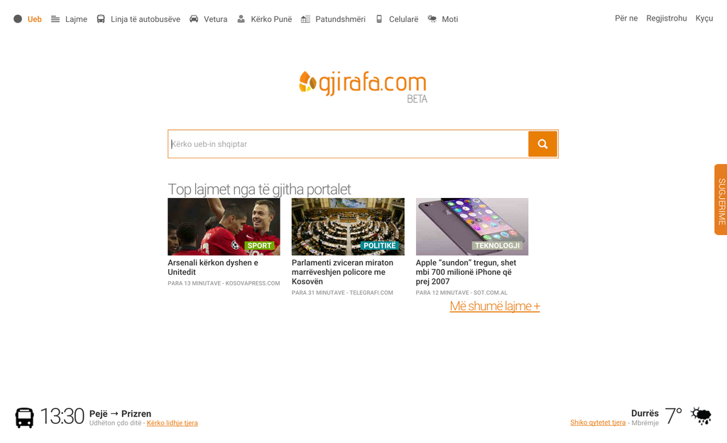
Gjirafa HomePage

For Albanians, By Albanians

Since we last interviewed Cahani, Gjirafa has continued to experience rapid growth in its user base. The service depends on Albanian speakers taking pride in home-grown competition for search goliaths like Google, Yahoo, and Yandex. Cahani said of the service’s patriotic nature: “The first [Albanian speakers] they like about Gjirafa is that it’s their language, and that it’s an Albanian/Kosovar company. They’re really proud of that fact, and they think it’s past due, frankly. They feel that Gjirafa is theirs and they identify themselves with it – and that’s exactly what we want. We are for Albanians, and the reaction has been really strong.”

asdas

Mergim Cahani Unveiled Gjirafa at a Press Event last year.


Gjirafa met its investment goal for an angel round last fall, following participation in StartupYard 2014. They are now working on expanding and perfecting their search platform, attracting more users to the platform. They also plan on bringing new e-commerce and search solutions to local Albania/Kosovo regional partners, and making themselves central to the growing online market in the region.